In the previous chapter, we analyzed bivariate relationships between item- and scale-level measures of collective efficacy and perceived and experienced criminal behaviors in residents’ neighborhoods. We found that individuals who perceive their neighborhood to be high in collective efficacy (at least for certain items meant to measure the key sub-dimensions of collective efficacy–social cohesion and informal social control) generally perceived less crime in their neighborhood and, to a lesser extent, report fewer direct experiences with criminal victimization. Of course, the theory of collective efficacy was not developed to explain individual-level differences in neighborhood perceptions and crime. Rather, it was conceived as a collective neighborhood-level corollary to the classic psychological concept of self-efficacy. Instead of emphasizing an individual’s belief in their ability to succeed in specific situations or accomplish a specific task, collective efficacy is meant to capture a community or neighborhood’s collective “mutual trust or willingness to intervene for the common good…(Sampson et al., 1997: p. 919)” such as controlling crime and antisocial behavior. With this in mind, we turn to visualizing neighborhood-level variations in collective efficacy and crime below.
6.0.2 Load the Data
First, we need to load the crime rate data with geographic information for mapping and the survey data with a neighborhood identifier that corresponds to the neighborhoods in the crime rate data (see Appendix II section 11.0.1). We will also load the pre-processed analytic data from the prior chapter that includes our collective efficacy and crime-related items, sub-scales, and scales.
We can start by mapping the geographic characteristics of the data, including the neighborhoods that were sampled. The sf package is designed to work with a host of different plotting packages. While the sf package has some built-in plotting features and we typically prefer the generality of ggplot2 for making plots in R, the “leaflet” package seems to provide access to one of the most all-purpose mapping tools. So we’ll use that below to allow for some degree of interactivity.
First, we can map whether the neighborhood was sampled and whether it was part of the random or high crime sample.
In the above plot, hovering over the neighborhoods will reveal their names and clicking on the neighborhoods will reveal additional information, including the population from the 2020 census, whether it was sampled and which sample if so (random; high violent crime), and the crime rate (violent, property, and total) in 2024. You will notice that neighborhoods from the “High Crime Sample” are clustered around the geographic center of the city and just south of the central business district (Missouri River to the north and 31st street to the south).
Although redundant with information Dr. Kotlaja already has, we can also map the crime rate data as well. We present this in separate tabs below. We have capped the maximum values to be a round number that is close to 2 standard deviations above the mean crime rate for all crime, violent crime, and property crime respectively.
The charts above largely reproduce the story evident in the sampling map. Neighborhoods with higher crime are generally concentrated just south of the central business district. Of course, since the “high crime” sample was selected based on violent crime rates, the “high crime” sample neighborhoods correspondingly includes all but a few of the neighborhoods with the highest violent crime rates (notable exceptions not sampled include Hospital Hill, Northeast Industrial District, and Blue Valley Industrial neighborhoods).
6.0.4 Aggregating Survey Data
The above maps are simply plotting administrative data. More relevant to our purposes is to map the aggregated survey data on collective efficacy and perceived crime and experienced victimization to the neighborhood level. To do this, we first need to aggregate the individual-level data to the neighborhood level and map them similar to how we did above. But first, before reinforcing the formal neighborhood boundaries as defined by the Kansas City government, it is worth examining what survey respondents identified as their neighborhood.
6.0.4.1 Residents’ Perceived Neighborhoods
As Dr. Kotlaja anticipated, residents do not necessarily identify their neighborhood as the official neighborhood boundaries. A simple way to assess this is by identifying all unique combinations of the NBHD and Q1_1_Text (self-reported neighborhood name) variables in the survey data and then comparing alongside the official neighborhood names from the crime rate data.
North Lakes is the subdivision but I think maybe Tiffany Springs is the area?
221
The Coves
294
7
The Coves
221
The Coves
168
8
Woodfield
205
Ravenwood-Somerset
171
8
Ravenwood Somerset
205
Ravenwood-Somerset
256
8
Somerset
205
Ravenwood-Somerset
295
8
Ravenwood-Somerset
205
Ravenwood-Somerset
296
8
Ravenwood-Sommerset
205
Ravenwood-Somerset
298
8
Carriage Hill Estates
205
Ravenwood-Somerset
299
9
Maple Park
210
Maple Park
301
10
winnwood gardens
207
Winnwood Gardens
302
10
Winnwood Gardens
207
Winnwood Gardens
37
11
Lykins
17
Lykins
51
11
Northeast
17
Lykins
182
11
17
Lykins
211
11
Old Northeast
17
Lykins
237
11
Pendleton heights
17
Lykins
242
11
Lykins or ne
17
Lykins
20
12
Longfellow
12
Longfellow
22
12
12
Longfellow
23
12
Longfellow heights
12
Longfellow
222
12
Lomgfellow
12
Longfellow
34
13
62
Palestine East
36
13
Palestine
62
Palestine East
225
13
East Palestine
62
Palestine East
229
13
The 30s
62
Palestine East
308
13
Palestine East
62
Palestine East
310
13
Palestin area
62
Palestine East
1
14
Blue Valley
31
South Blue Valley
2
14
31
South Blue Valley
3
14
Vanbrunt
31
South Blue Valley
6
14
Blue valley
31
South Blue Valley
95
14
Van brunt
31
South Blue Valley
152
14
East side
31
South Blue Valley
316
14
South Blue Valley
31
South Blue Valley
44
15
60
Oak Park Southeast
250
15
Oak Park
60
Oak Park Southeast
318
15
Oak park
60
Oak Park Southeast
4
16
76
North Hyde Park
35
16
Hyde park
76
North Hyde Park
107
16
North Hyde park
76
North Hyde Park
145
16
Hyde Park
76
North Hyde Park
177
16
North Hyde Park
76
North Hyde Park
320
16
North hyde park
76
North Hyde Park
321
16
North Hydepark
76
North Hyde Park
17
17
Art institute/ south Moreland
80
Southmoreland
46
17
Southmoreland
80
Southmoreland
50
17
Souhmoreland
80
Southmoreland
123
17
South Moreland / Westport
80
Southmoreland
164
17
Westport
80
Southmoreland
45
18
River Market
2
River Market
106
18
River market
2
River Market
322
18
2
River Market
324
18
Market Station
2
River Market
52
19
Creek wood commons
192
Davidson
169
19
South Oakwood
192
Davidson
238
19
Williamsburg
192
Davidson
326
19
Cooley Highlands
192
Davidson
327
19
192
Davidson
330
19
Creekwood
192
Davidson
10
21
Ruskin Heights
171
Ruskin Heights
60
21
171
Ruskin Heights
64
21
Ruskin heights
171
Ruskin Heights
85
21
Ruskin
171
Ruskin Heights
210
21
Ruskin heights/ Hickman mills area
171
Ruskin Heights
259
21
Terrace
171
Ruskin Heights
260
21
Off manchester
171
Ruskin Heights
273
22
128
East Meyer 6
276
22
Roseville
128
East Meyer 6
269
23
131
Brown Estates
270
23
Brown estates
131
Brown Estates
154
24
178
Little Blue
9
25
Hickman Mills
169
Hickman Mills South
83
25
Hickman mills south
169
Hickman Mills South
84
25
169
Hickman Mills South
332
25
holiday hills
169
Hickman Mills South
7
26
Waldo
106
Tower Homes
62
26
Tower park
106
Tower Homes
129
26
Rock hill garden
106
Tower Homes
138
26
106
Tower Homes
150
26
Tower Homes
106
Tower Homes
186
26
Tower
106
Tower Homes
202
26
Tower homes
106
Tower Homes
209
26
Tower Park
106
Tower Homes
253
26
Rockhill Gardens
106
Tower Homes
15
27
Linden Hills
142
Linden Hills And Indian Heights
29
27
Linden hills
142
Linden Hills And Indian Heights
76
27
Linden Hill
142
Linden Hills And Indian Heights
146
27
Linden Hiils
142
Linden Hills And Indian Heights
181
27
Linden Hills and Indian heights
142
Linden Hills And Indian Heights
67
28
Waldo Homes
110
Waldo Homes
68
28
Waldo
110
Waldo Homes
142
28
110
Waldo Homes
335
28
Rock hill Gardens
110
Waldo Homes
14
29
Marlboro Height
95
Morningside
53
29
Morningside
95
Morningside
54
29
Wornell Homestead
95
Morningside
56
29
Morninside
95
Morningside
338
29
Brookside
95
Morningside
342
29
Morningside Neighborhood Is our neighborhood association
95
Morningside
43
30
186
Richards Gebaur
90
30
Grandview
186
Richards Gebaur
11
31
Paseo West
5
Paseo West
12
31
5
Paseo West
89
31
West Paseo
5
Paseo West
272
31
Rosehill Townhomes
5
Paseo West
345
31
Paseowest
5
Paseo West
24
33
key coalition
56
Key Coalition
25
33
Key Coalition
56
Key Coalition
26
33
Key Coaltion
56
Key Coalition
27
33
Not that I know of
56
Key Coalition
28
33
Key coalition
56
Key Coalition
109
33
Ivanhoe
56
Key Coalition
161
33
56
Key Coalition
215
33
Spring Hill
56
Key Coalition
16
34
Ivanhoe ne
55
Ivanhoe Northeast
39
34
55
Ivanhoe Northeast
40
34
Ivanhoe Gardens
55
Ivanhoe Northeast
41
34
Ivanhoe
55
Ivanhoe Northeast
233
34
Ivahoe
55
Ivanhoe Northeast
38
35
Dunbar gardens
66
Dunbar
108
35
Dunbar
66
Dunbar
151
35
66
Dunbar
348
35
Leeds
66
Dunbar
48
36
81
Old Westport
57
36
Valentine
81
Old Westport
112
36
Westport
81
Old Westport
114
36
Westport - nbhd org. name is Heart of Westport
81
Old Westport
258
36
Westport area
81
Old Westport
351
36
WESTPORT ENTERTAINMENT DISTRICT
81
Old Westport
352
37
Mount hope
51
Mount Hope
353
37
Boston Heights/Mount Hope
51
Mount Hope
354
37
I think it’s Mt. Hope
51
Mount Hope
5
38
Ivanhoe
54
Ivanhoe Southeast
199
38
Ivanhoe Neighborhood
54
Ivanhoe Southeast
235
38
Ivanhoe Se
54
Ivanhoe Southeast
252
38
54
Ivanhoe Southeast
130
39
134
East Swope Highlands
131
39
Manchester
134
East Swope Highlands
355
39
East Swope Highlands
134
East Swope Highlands
356
39
East Meyer
134
East Swope Highlands
277
40
122
Blenheim Square Research Hospital
8
41
Union Hill
11
Union Hill
30
41
Union hill
11
Union Hill
110
41
Ivanhoe, olive st.
11
Union Hill
227
41
The 30s
11
Union Hill
120
42
59
Oak Park Southwest
165
42
Oak park
59
Oak Park Southwest
366
42
Oak park southwest
59
Oak Park Southwest
368
42
Ivanhoe
59
Oak Park Southwest
370
43
Rosehill
NA
NA
371
43
NA
NA
372
43
Bristol Park
NA
NA
377
43
Pembrooke Estates
NA
NA
379
43
Brandon mosley
NA
NA
380
43
Rosehill townhomes
NA
NA
381
43
Oak crest
NA
NA
382
43
Rolling Meadows
NA
NA
383
43
Tiffany Springs
NA
NA
Scrolling through the table above offers a basic sense of the differences in how residents identify their neighborhoods. Despite substantial overlap, there also appears to be much greater variation in residents’ reports of their neighborhood compared to official boundaries as anticipated (cf. here, here, here, and here). Nonetheless, for this initial report, we will rely on the official neighborhood boundaries since they permit direct comparisons with the aggregated crime data we received.
6.0.4.2 Aggregate key measures to the Neighborhood-level
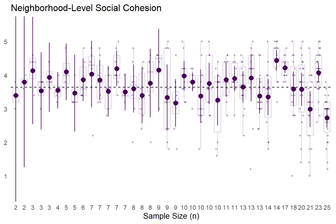
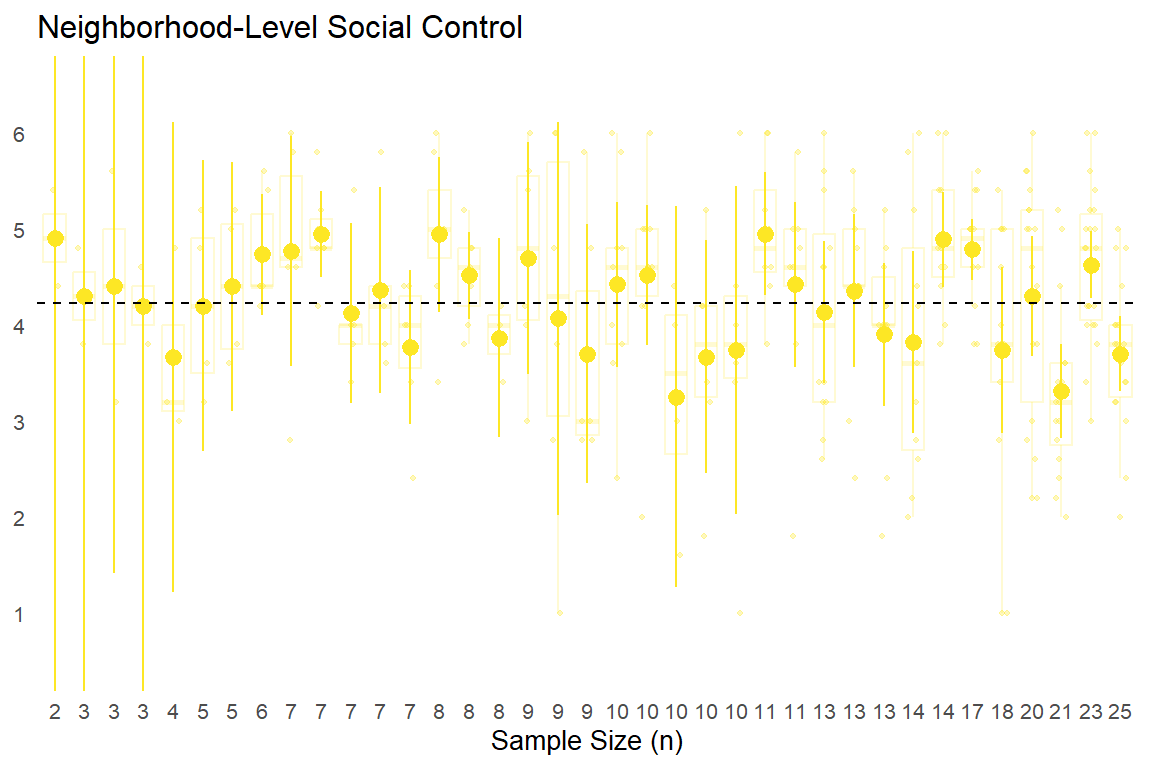
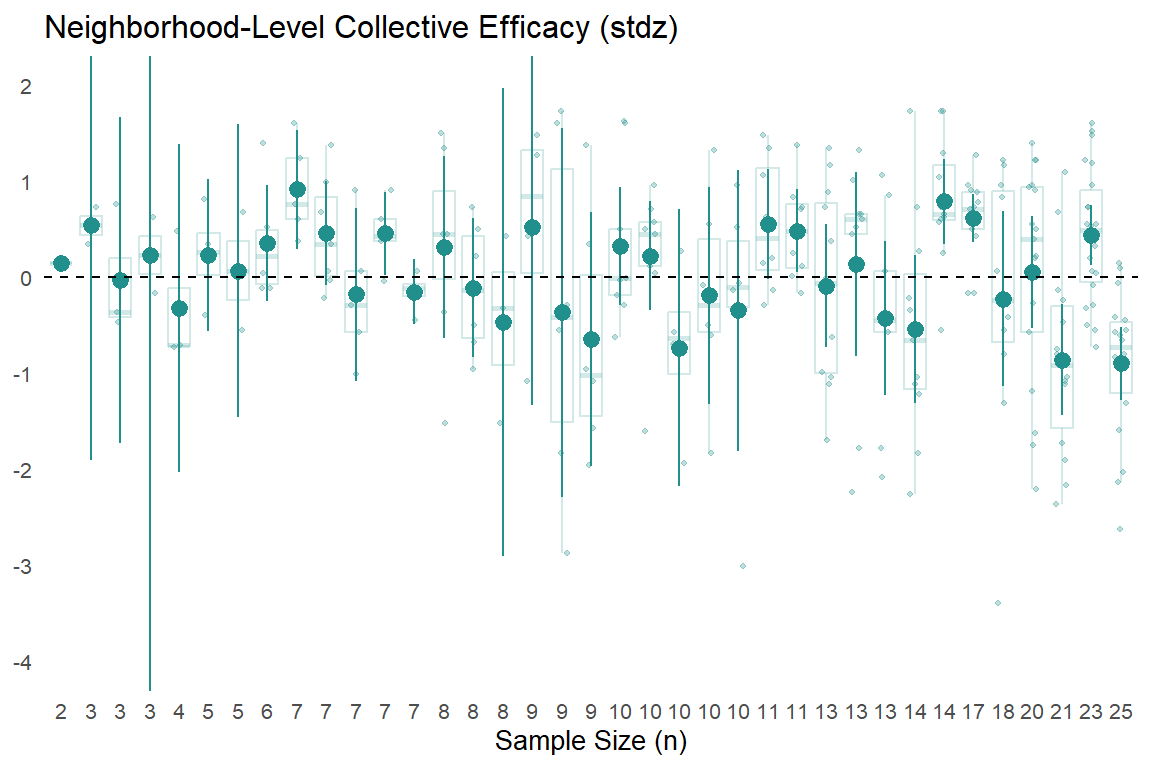
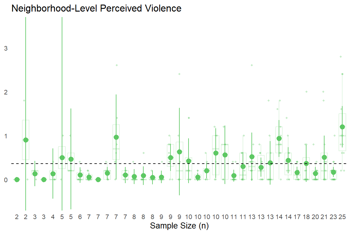
The next step is to aggregate the survey data and merge it with the crime rate data. All we need for this are the NBHD variable that indicates the neighborhoods sampled and the specific measures we want to aggregate (e.g., collective efficacy, perceived violence, and experienced victimization). In addition to aggregating the data by calculating the mean of each of our key variables, we will also calculate standard errors and confidence intervals for the mean that we will use later to build our intuition about the uncertainty of these estimates of neighborhood-level values.
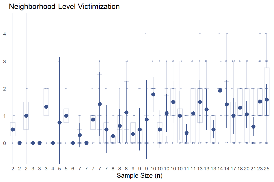
The above table presents the neighborhood-level means for the key scales we constructed and analyzed in the previous chapters.1 We also added the total number of observations and total number of missing observations for each scale. Comparing these rows (and subtracting the missing from total) will give you a sense of the effective (sub)sample size from which each of these means were calculated. Neighborhoods with fewer effective observations will generally produce noisier mean values than those with more effective observations.
We can help build this intuition by plotting these mean values with their 95% confidence intervals based on a t-distribution.2 Additionally, we will show semi-transparent data points and box plots to visualize the degree of variation in individual responses used to comprise each aggregated neighborhood-level “observation.”
Show code
library(ggplot2)library(dplyr)library(rlang) # For {{ }} operator### Neighborhood Plot Functionnbhd_plot <-function( data_agg, # Aggregated dataset (e.g., kc_combsurv_agganal) data_ind, # Indivdiual dataset for hline (e.g., kc_combsurv_ceanal) y_var, # Main y-variable (e.g., mean_cohesion) ymin_var, # Lower CI variable (e.g., low95ci_cohesion_tdist) ymax_var, # Upper CI variable (e.g., up95ci_cohesion_tdist) filter_na_var, # Variable to check for NAs before filtering (e.g., sem_cohesion) hline_var_ind, # Variable in raw data for hline (e.g., soc_cohesion)plot_title =NULL, # Title for the plotgroup_var = NBHD, # Grouping variable for x-axis (defaults to NBHD)order_var = n, # Variable to order by on x-axis (defaults to n)point_color ="black", # Color for geom_pointrangey_axis_breaks =NULL,y_coord_limits =NULL,x_axis_title =NULL) {# Prepare data for plotting (filtering and creating the n_lookup) plot_data <- data_agg %>%filter(!is.na({{ filter_na_var }}))# n_lookup needs to be created from the data that will be used in ggplot# and specifically from the 'group_var' and 'order_var' columns.# We need to ensure 'order_var' is treated as a symbol for creating the named vector.# This assumes 'group_var' and 'order_var' exist in 'plot_data'.# If 'order_var' is 'n', then this works. n_lookup_dynamic <-setNames( plot_data[[as_name(enquo(order_var))]], # Get the column specified by order_var plot_data[[as_name(enquo(group_var))]] # Get the column specified by group_var )ggplot(plot_data, aes(x =reorder({{ group_var }}, {{ order_var }}), y = {{ y_var }})) +geom_pointrange(aes(ymin = {{ ymin_var }}, ymax = {{ ymax_var }}), color = point_color) +geom_hline(data = data_ind, aes(yintercept =mean({{ hline_var_ind }}, na.rm =TRUE)),linetype =2) +scale_y_continuous(breaks = y_axis_breaks) +coord_cartesian(ylim = y_coord_limits) +scale_x_discrete(labels =function(x_breaks) {# x_breaks are the actual values from the 'group_var' column in their plotted orderas.character(n_lookup_dynamic[x_breaks]) },name = x_axis_title ) +theme_minimal(base_size =10) +labs(title = plot_title) +theme(panel.grid = ggplot2::element_blank(),axis.title.y = ggplot2::element_blank() )}### Neighborhood Box Plot Function with Data Points & Mean Overlaynbhd_box_plot <-function( data_agg, # Aggregated dataset (for means and CIs) data_ind, # Individual dataset for box plots and points y_var_ind, # Individual-level y-variable (e.g., soc_cohesion) y_var_agg, # Aggregated mean variable (e.g., mean_cohesion) ymin_var, # Lower CI variable (e.g., low95ci_cohesion_tdist) ymax_var, # Upper CI variable (e.g., up95ci_cohesion_tdist) filter_na_var, # Variable to check for NAs before filtering hline_var_ind, # Variable in raw data for hlineplot_title =NULL,group_var = NBHD,order_var = n,box_color ="black", # Box outline colorbox_alpha =0.8, # Box outline transparencypoint_color ="gray60",point_alpha =0.4,point_size =0.8,y_axis_breaks =NULL,y_coord_limits =NULL,x_axis_title =NULL) {# Prepare aggregated data for ordering and means agg_data <- data_agg %>%filter(!is.na({{ filter_na_var }}))# Prepare individual data, filtering to neighborhoods in agg_data ind_data <- data_ind %>%filter({{ group_var }} %in% agg_data[[as_name(enquo(group_var))]]) %>%filter(!is.na({{ y_var_ind }}))# Create n_lookup for x-axis labels n_lookup_dynamic <-setNames( agg_data[[as_name(enquo(order_var))]], agg_data[[as_name(enquo(group_var))]] )# Get neighborhood order from aggregated data nbhd_order <- agg_data %>%arrange({{ order_var }}) %>%pull({{ group_var }})# Create the plotggplot() +# Semi-transparent individual data pointsgeom_point(data = ind_data,aes(x =factor({{ group_var }}, levels = nbhd_order), y = {{ y_var_ind }}),color = point_color, alpha = point_alpha, size = point_size,position =position_jitter(width =0.2, height =0)) +# Box plots with transparent fillgeom_boxplot(data = ind_data,aes(x =factor({{ group_var }}, levels = nbhd_order), y = {{ y_var_ind }}),fill ="transparent", color =alpha(box_color, box_alpha),outlier.shape =NA) +# Point-interval overlay (same color as box)geom_pointrange(data = agg_data,aes(x =factor({{ group_var }}, levels = nbhd_order),y = {{ y_var_agg }},ymin = {{ ymin_var }}, ymax = {{ ymax_var }}),color = box_color) +# Same color as box outline# Overall mean horizontal linegeom_hline(data = data_ind,aes(yintercept =mean({{ hline_var_ind }}, na.rm =TRUE)),linetype =2) +scale_y_continuous(breaks = y_axis_breaks) +coord_cartesian(ylim = y_coord_limits) +scale_x_discrete(labels =function(x_breaks) {as.character(n_lookup_dynamic[x_breaks]) },name = x_axis_title ) +theme_minimal(base_size =10) +labs(title = plot_title) +theme(panel.grid =element_blank(),axis.title.y =element_blank() )}
In the above plots, the point-intervals clearly show the inverse relationship between sub-sample size and uncertainty in estimates as expected, with extremely wide 95% CIs for aggregated neighborhood estimates comprised of a few responses (left side of each plot) that tend to narrow substantially as the number of observations per neighborhood increases.
With that said, the semi-transparent data point spreads and box plot widths behind the point-intervals also shows that the increased “certainty” presumably gained via larger sample sizes masks substantial within-neighborhood heterogeneity in individual responses. You can also see some of the limits in trying to estimate uncertainty from the observed data, especially with the neighborhood-level victimization. For some small sub-samples, (e.g., n = 2 - 7), everyone surveyed in that neighborhood reported no experiences with criminal victimization and thus, there are no uncertainty estimates. We could estimate a simple multilevel model to get more reasonable (and more conservative) uncertainty estimates, but we’ll forgo that for now in order to actually map these values.
6.0.5 Mapping Survey Data
Since the aggregate survey data above only has the sampled neighborhoods, we first need to merge the data with the full crime date data.
Next, we can plot our scales and subscales at the neighborhood level. Of course, readers should consider the above differences in (sub)sample sizes and within-neighborhood variability (as well as item-level heterogeneity) observed previously when considering the reliability of these aggregate estimates.
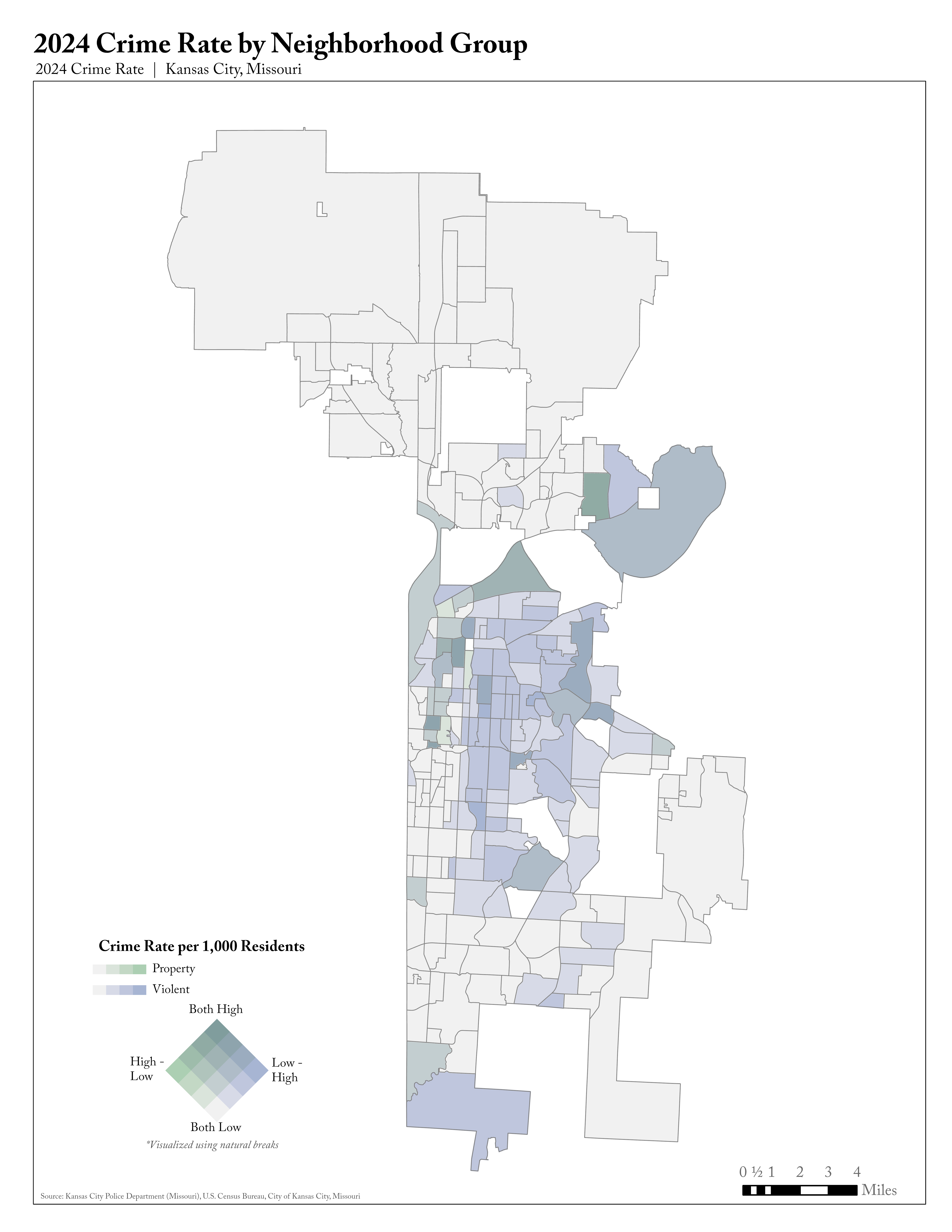
The choropleth maps shown above are useful for looking at the distribution of single variables across neighborhoods. But, as documented at the individual-level in the previous chapter, we are primarily interested in how collective efficacy is related to crime-relevant variables. If we want to map bivariate relationships, we need to create a bivariate choropleth map. Logan already did this with the crime rate data by plotting both violent and property crime on the same map:
Logan’s Bivariate Choropleth
Note that Logan uses “natural breaks” to classify neighborhoods on the 16-category two-dimensional scale. Our understanding is that this is a data-driven approach where natural breakpoints are found that minimize within-class variance. It is also our understanding that this is less common than quantile breaks (dividing data into a specified number of equal groups) in practice but also probably more appropriate given it relies on finding actual clusters in the data. We will use less precise (e.g., 9-category scale) and less sophisticated methods (e.g., quantile classification) in attempting to construct similar bivariate choropleth maps using the survey data.
Show code
# library(dplyr)# library(biscale)biclass_palfactor <-function(data, x_var, y_var, style ="quantile", dim =3, keep_factors =TRUE) {# Check if necessary packages are loadedif (!requireNamespace("dplyr", quietly =TRUE)) {stop("Package 'dplyr' is needed. Please install and load it.", call. =FALSE) }if (!requireNamespace("biscale", quietly =TRUE)) {stop("Package 'biscale' is needed. Please install and load it.", call. =FALSE) }# Create a temporary data frame with renamed columns temp_data <- data temp_data$x_temp <- data[[x_var]] temp_data$y_temp <- data[[y_var]]# Call bi_class with the temporary column names biclass_data <-bi_class(.data = temp_data, x = x_temp, y = y_temp, style = style, dim = dim,keep_factors = keep_factors) %>%select(-x_temp, -y_temp) # Remove temporary columns# 2. Systematically generate expected_levels based on dim_val level_combinations <-expand.grid(x_cat =1:dim, y_cat =1:dim) expected_levels <-paste(level_combinations$x_cat, level_combinations$y_cat, sep ="-")# 3. Process the "bi_class" column (which was created by biscale::bi_class) data_processed <- biclass_data %>% dplyr::mutate(bi_class =ifelse(as.character(bi_class) =="NA-NA", NA_character_, as.character(bi_class)),bi_class =factor(bi_class, levels = expected_levels) )return(data_processed)}
It may be interesting to compare the bivariate crime map with the univariate total crime. The neighborhoods classified as both high property and high crime rate (3-3) will obviously have higher total crime, but there may be some neighborhoods where property crime is driving their relatively high crime rates.
Show code
totcrime_map crime_bivmap
6.0.6.2 Survey Data
In the above crime rate map, we had 237 neighborhoods for which crime rate data were available (missing 10 observations). This means that the quantile classification scheme with three dimensions divided the data into three even categories (n = 79) based on their levels of property crime and violent crime separately. Below, in our maps showing the bivariate relationship between aggregated survey data, we only have at most 40 neighborhoods and in some cases fewer. This means that groups of neighborhoods classified by quantiles are much smaller (e.g., 12 - 14).
The above map shows the three-by-three quantile classification of neighborhood-level social cohesion and social control. Recall that Sampson and colleagues (1997) emphasize the necessity of neighborhoods being high in both constructs. It is these two constructs coming together that produces neighborhoods with high collective efficacy and thus presumably makes them better at preventing crime. A few interesting geographic patterns emerge in the above map.
First, there are relatively high levels of both social cohesion and social control in the neighborhoods sampled in the northern parts of the city. The central Kansas City area shows more variation, with many neighborhoods displaying moderate levels of both measures (lighter purple/pink shades). Neighborhoods that are both low in social cohesion and control seem to be concentrated in the eastern and southeastern parts of the city. Interestingly, according to this quantile classification, while 2 neighborhoods were classified as “low” in social cohesion and high” in social control (dark pink neighborhoods in the north) control, none of the sampled neighborhoods are classified as “high” in social cohesion and “low” in social control (no dark teal neighborhoods).
By placing this chart next to the univariate collective efficacy chart, we should be able to get a sense of how these variables come together to produce our collective efficacy measure.
Show code
surv_coleff_mapcohcontrol_bivmap
Ultimately, we are interested in how these reported neighborhood conditions relate to crime outcomes. So, below we will map relationships between collective efficacy and perceived violence and experienced criminal victimization. We will do this for our standardized collective efficacy scale as well as separately for the social cohesion and social control sub-scales.
The above plots generally align with theoretical predictions from collective efficacy theory and empirical results of Sampson et al. (1997). Neighborhoods that are high in collective efficacy tend to perceive less violence. Of the neighborhoods sampled for the community survey, these types of neighborhoods tend to be concentrated in the northern part of the city in this sample. Conversely, residents also tend to perceive more violence in neighborhoods with low aggregate levels of collective efficacy. In the community survey sample, these neighborhoods are concentrated primarily in the south and eastern parts of the city.
There are relatively few neighborhoods classified in categories that would directly contradict the theoretical predictions of collective efficacy theory. Only one neighborhood in the northern part of the center of the city (River Market) was classified as “high” in collective efficacy and “high” in perceived violence (dark blue color). Only two neighborhoods (Blenheim Square Research Hospital; East Swope Highlands) were classified as “low” in collective efficacy and “low” in perceived violence (grey color) - both in the southeastern part of the city.
When comparing the maps of the respective components of collective efficacy–social cohesion and social control–and their relationship to perceived violence, the results are generally similar. However, there are some potentially interesting differences in the spatial clustering. For example, the social cohesion x perceived violence map shows a somewhat weaker spatial clustering with the “safe” neighborhoods characterized by “high” social cohesion and “low” perceived violence (dark turquoise) being less extensive in the northern part of the city than in the collective efficacy x perceived violence map. The social control x perceived violence map shows more similar patterns to the overall collective efficacy map.
The above plots, showing the spatial relationship between collective efficacy (and its components) with residents’ reported experiences with criminal victimization, are generally similar to the plots for perceived violence. However, the relationship appears weaker and not as spatially concentrated. Neighborhoods “high” in collective efficacy tend to also be “low” in reported victimization experiences. These “safe” neighborhoods tend to be concentrated in the northern part of the city while less “safe” neighborhoods characterized by “low” collective efficacy and “high” victimization experiences are generally concentrated in the southern and eastern parts of the city. Yet, unlike with perceived violence, more neighborhoods are classified as “low” in both (grey colored neighborhoods in south and eastern parts of center of city) and “high” in both (dark blue neighborhoods in western part of central city). Similar to perceived violence, when examining the components of collective efficacy, social control by experienced victimization shows a stronger relationship overall and more spatial patterning than social cohesion by experienced victimization.
6.0.6.3 Crime Rate & Survey Data
The last thing we will examine here is the relationship between our aggregated survey measures and the official crime statistics. This will allow us to look at the relationship between perceived violence and actual violence as well as the self-reported criminal victimization and official crime. We will also show the relationship between collective efficacy and official crime measures.
One interesting pattern revealed in the mapped bivariate relationships between residents’ perceived violence and official crime measures is that, if one looks only at total crime, residents appear to be misperceiving crime in their neighborhoods. This is especially the case in the northern part of the city, where some of the neighborhoods have low perceived violence and a relatively high total crime rate (dark pink color). However, recall the crime perceptions items ask about violence, and total crimes is comprised largely of property more so than violent crimes. Thus, focusing specifically at the relationship between perceived violence and officially measured violent crime rates shows a different pattern, where residents appear to be perceiving violence fairly accurately. Indeed, there are fewer neighborhoods categorized with extreme mismatches between perceptions and official measures. Likewise, the apparent misperception is present in the map of the relationship between perceived violence and official property crime (which is expected given the property crime numbers are largely driving the total crime numbers); these inconsistencies appear to stem from differences in spatial clustering of property versus violent crimes acrross these neighborhoods.
6.0.6.3.2 Exp. Victimization
Show code
# Define legend titles for each combinationlegend_titles <-c("Exp. Crime by\nTotal Crime (per 1,000)","Exp. Crime by\nViolent Crime (per 1,000)", "Exp. Crime by\nProperty Crime (per 1,000)")# Create three maps using map()expcrime_crime_bivmaps <-map(1:length(yvars), function(i) {# Classify neighborhoods for this x variable biv_data <-biclass_palfactor(data = kc_combsurv_agganal_sf,x_var ="mean_expcrime",y_var = yvars[i],dim =3)# Create the bivariate leaflet mapbivariate_leaflet_map(data = biv_data,x_var ="mean_expcrime",y_var = yvars[i], x_label ="Exp. Crime",y_label = y_labels[i],palette ="DkBlue2",dim =3,legend_title = legend_titles[i],popup_content = survey_popup,na_label ="Not Sampled",label_col =NULL,cell_size =35 )})
An interesting pattern revealed by the experienced victimization maps is their relative similarity to the perceived violence maps. Given three of the four experienced crime questions were about property crimes, we may have expected them to more accurately reflect total and property crime. There are many potential explanations for this, such as weak relationships between official property crime and perceptions and experiences with crime, or that experiencing any crime might lead to increased perceptions of crime regardless of the specific type. These patterns could also reflect underlying issues with measurement and/or sampling (e.g., perhaps people who have experienced victimization are less likely to respond to a survey, even given the community-engaged approach). Furthermore, to the extent that crime rates are driven by neighborhood-level factors, asking people about their perceptions of violence in a neighborhood and aggregating that to the neighborhood level might be a better future approach for capturing posited neighborhood-level processes than is asking residents about their individual (direct) experiences and then aggregating to neighborhood-level measures.
6.0.6.3.3 Collective Efficacy
Show code
# Define legend titles for each combinationlegend_titles <-c("Collective Efficacy by\nTotal Crime (per 1,000)","Collective Efficacy by\nViolent Crime (per 1,000)", "Collective Efficacy by\nProperty Crime (per 1,000)")# Create three maps using map()coleff_crime_bivmaps <-map(1:length(yvars), function(i) {# Classify neighborhoods for this x variable biv_data <-biclass_palfactor(data = kc_combsurv_agganal_sf,x_var ="mean_coleffz",y_var = yvars[i],dim =3)# Create the bivariate leaflet mapbivariate_leaflet_map(data = biv_data,x_var ="mean_coleffz",y_var = yvars[i], x_label ="Collective Efficacy",y_label = y_labels[i],palette ="DkBlue2",dim =3,legend_title = legend_titles[i],popup_content = survey_popup,na_label ="Not Sampled",label_col =NULL,cell_size =35 )})
Given the general inverse relationship between collective efficacy and our survey measures of perceived violence and experienced victimization, it is not surprising to see that these patterns are largely reproduced in bivariate maps displaying relationships between collective efficacy and official crime rates.
6.0.7 Conclusion
This spatial analysis of collective efficacy in Kansas City neighborhoods reveals geographic patterns that support some of the general theoretical predictions of collective efficacy theory while highlighting potentially important variability in how residents perceive and experience crime in their communities.
6.0.7.1 Key Spatial Patterns
The mapping analysis demonstrates clear geographic clustering of collective efficacy and crime-related outcomes across Kansas City neighborhoods. Neighborhoods with high collective efficacy—-characterized by strong social cohesion and informal social control-—are predominantly concentrated in the northern parts of the city. Conversely, neighborhoods with lower collective efficacy tend to be clustered in the south and eastern areas, particularly around the central business district where the “high crime” (official violence rates) sample neighborhoods were located.
This spatial distribution aligns closely with both official crime statistics and residents’ perceptions of neighborhood safety. The bivariate choropleth maps reveal that neighborhoods high in collective efficacy tend to have lower levels of perceived violence and reported criminal victimization, while areas with weaker collective efficacy show the opposite pattern.
6.0.7.2 Perceptions vs. Reality
One of the most intriguing findings emerges from comparing residents’ perceptions with official crime statistics. While residents appear to accurately perceive violent crime in their neighborhoods, there are notable discrepancies when it comes to total crime rates, largely driven by differences in spatial clustering of property crime vis-a-vis violent crime. Some northern neighborhoods show relatively high official crime rates alongside low perceived violence, suggesting that residents may be more attuned to violent crimes that directly threaten personal safety than to property crimes that may be less visible or personally threatening.
6.0.7.3 Components of Collective Efficacy
The separate analysis of social cohesion and social control reveals that both components contribute to overall associations between collective efficacy and crime outcomes, but social control appears to show stronger and more consistent spatial patterns in relation to crime outcomes. This finding may suggest that while social cohesion among neighbors might matter (and especially social trust and civility; see section 5.0.7), the willingness and capacity of residents to intervene for the common good (and particularly to stop violence and/or solve other essential civil problems; again, see section 5.0.7) may be the more critical component for crime prevention.
6.0.7.4 Methodological Considerations and Limitations
Several important limitations should be acknowledged. The relatively small sample sizes within individual neighborhoods (ranging from 2 to 25 respondents) create substantial uncertainty in neighborhood-level estimates, as clearly demonstrated by the confidence interval plots. Neighborhoods with fewer respondents produce noisier estimates that should be interpreted with caution. Additionally, the quantile classification approach used for the bivariate maps results in very small categories when applied to survey data, making the classifications sensitive to outliers and measurement error.
The analysis also reveals the challenge of reconciling official neighborhood boundaries with residents’ own conceptualizations of their neighborhoods. Many survey respondents identified their neighborhoods differently than the official designations, highlighting the potential mismatch between administrative boundaries and lived community experiences.
6.0.7.5 Future Research Directions
This analysis opens several avenues for future research. Multilevel modeling and advanced spatial modeling approaches might provide more robust estimates of neighborhood-level collective efficacy while properly accounting for individual-level variation and small sample sizes. Longitudinal data would allow for examination of how collective efficacy and crime patterns change over time and whether interventions successfully alter these relationships.
Additionally, more detailed investigation of the mechanisms linking collective efficacy to different types of crime could inform more targeted intervention strategies. Understanding why collective efficacy appears more strongly related to violent than property crime could help communities develop more comprehensive approaches to neighborhood safety.
The spatial analysis presented here demonstrates that collective efficacy theory provides a valuable framework for understanding neighborhood variation in crime and safety, while also revealing the complex ways that theory translates into practice across the urban landscape. As Kansas City and other cities work to build safer, more cohesive communities, these findings provide promising observational empirical support for collective efficacy-based interventions and suggest guidance on where and how such efforts might be most effectively deployed.
Kuriakose, Noble, and Michael Robbins. 2015. “Don’t GetDuped: Fraud Through Duplication in PublicOpinionSurveys.” {SSRN} {Scholarly} {Paper}. Rochester, NY: Social Science Research Network. https://papers.ssrn.com/abstract=2580502.
Revelle, William. 2024. “The Seductive Beauty of Latent Variable Models: Or Why I Don’t Believe in the EasterBunny.”Personality and Individual Differences 221 (April): 112552. https://doi.org/10.1016/j.paid.2024.112552.
Sampson, Robert J., Stephen W. Raudenbush, and Felton Earls. 1997. “Neighborhoods and ViolentCrime: AMultilevelStudy of CollectiveEfficacy.”Science 277 (5328): 918–24. https://doi.org/10.1126/science.277.5328.918.
Recall, this aggregation approach masks item-level (and perceived neighborhood boundary) heterogeneity by treating “collective efficacy” (and neighborhood designation) as a true latent construct that we have accurately measured without error. We think it may be valuable to skeptically interrogate such assumptions in future work.↩︎
The t-distribution is used to estimate 95% confidence intervals because of the relatively small sub-sample sizes within each neighborhood.↩︎