In our contract with Dr. Kotlaja, we specifically mentioned delivering a “technical report of descriptive analysis of collected data” and a “reanalysis/comparison of KC Community Survey trends data (if available).” In doing so we also mentioned “distribution-specific modeling of survey data (e.g., ordinal modeling for Likert-type items).” We did not specify the extent of our “descriptive analysis” and, given the length of the survey, there are numerous paths one could go down in constructing such analyses. Here, we are going to start by focusing on the items meant to measure (and conceptually replicate) Sampson et al.’s (1997) concept of “collective efficacy.” In doing so, we will examine collective efficacy’s relationship to violence (perceived neighborhood violence and self-reported violent victimization) in these data and descriptively replicate the core part of Sampson et al.’s (1997) foundational study. Unlike Sampson and colleagues, however, we will center our analyses on the item-specific effects and utilize an ordinal modeling approach that better captures the inherent data-generating process enforced by Likert-type questions used to measure the key variables of interest.1
Sampson et al’s (1997) measure of collective efficacy combines two sets of 5 items meant to measure 1) social cohesion and 2) informal social control. The social cohesion measure includes five questions asking about residents’ perceptions of the general social cohesion within the neighborhood (e.g., “people in the neighborhood can generally be trusted”). The informal social control measure includes five questions that ask about residents’ perceptions of whether neighbors would intervene in specific types of negative situations (e.g., scolding a child who was showing disrespect to an adult). Below, we create variables with informative variable names, ensure the variables are coded in the correct direction, and create an averaged scale for social cohesion, informal social cohesion, and collective efficacy overall.2
Above, we went ahead and created dummy variables for all of the “experienced crime” variables. Sampson et al. (1997) only looked at violence but also measured these different criminal behaviors. Otherwise, we have essentially created the key variables to investigate the relationship between collective efficacy and crime.3 Eventually, we may also want to recode and include demographic and neighborhood variables. But these will get us started.
For the analyses that follow, I’m going to follow the workflow Jon has been developing in some recent papers. First, we’ll produce some basic descriptive statistics for these variables using the datasummary_skim() function; Second, we’ll visualize the distritbutions of our key items with univariate bar charts and key bivariate relationships using mosaic plots; Third, we’ll examine bivariate correlations among all of the items described above, with a particular focus on the relationships among items meant to measure the same underlying constructs (e.g., collective efficacy), and the bivariate relationships predicted by collective efficacy theory (e.g., the relationship between collective efficacy and perceived violence). We will also highlight how the results are sensitive to a common analytical practice of applying a linear model to ordinal data. Ultimately, in the following chapter, we’ll show how these variables are distributed and potentially related geographically (e.g., bivariate choropleth; and similar).
5.0.3.1 Descriptive Statistics
Below, you can find descriptive statistics for all variables and collective efficacy, perceived violence, and victimization separately.
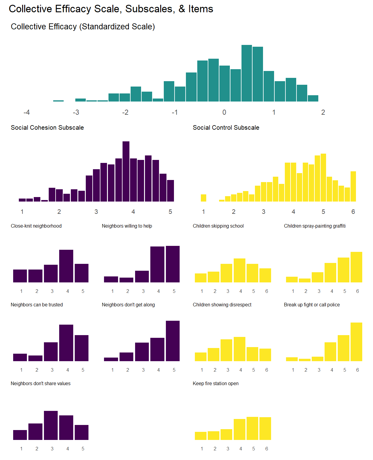
As evident in descriptives above, the collective efficacy scale has a normal-like distribution with some left skew (Mean = 4.0, Median = 4.1) whereas the social cohesion subscale is right skewed (Mean = 2.4, Median = 2.2) and the social control subscale is left skewed (Mean = 4.2, Median = 4.4). You can also see that the different item-level distributions vary in terms of their distribution being skewed towards the low end, middle, or high end of the answer scale. One issue with the collective efficacy scale and associated subscales is evident in the above descriptives–the subscales are made up of items with a different number of answer categories (social cohesion subscale is made up of questions with five answer categories while the social control subscale is made up of questions with six answer categories). Therefore, we went back and created standardized versions of each variable, subscales, and overall collective efficacy scale.
Also, as evident in the above descriptives, the perceived neighorhood violence and criminal victimization scales (and individual items) are “zero-inflated” or display a fairly strong right skew. This is to be expected with crime and violence variables.
5.0.3.2 Univariate Visualization
We can visualize these distributions with simple bar charts. We will show the individual items, subscales, and overall collective efficacy scales on the same plot. Although the primary focus of this chapter will be analyzing data at the individual item-level, these initial plots will provide a sense of how the aggregate scales look relative to the individual items.
Show code
#Function for creating a bar plot:basic_bar <-function(data, var_name, level_range =1:5, val_labels, fill_color ="#440154FF", title =NULL,reverse_coded =FALSE,x_label_angle =0,x_label_hjust =0,y_axis_limits =c(0, 1)) {# Determine if we need to reverse the axisif (reverse_coded) {# Reverse both the levels and labels#levels_to_use <- rev(level_range) labels_to_use <-rev(val_labels) } else {#levels_to_use <- level_range labels_to_use <- val_labels } data %>%filter(!is.na(.data[[var_name]])) %>%ggplot(aes(x =factor(.data[[var_name]],levels = level_range,labels = labels_to_use,ordered =TRUE))) +geom_bar(aes(y =after_stat(count)/sum(after_stat(count))), fill = fill_color) +scale_y_continuous(limits = y_axis_limits) +labs(y =NULL,subtitle = title ) +theme_minimal() +theme(axis.text.x =element_text(angle = x_label_angle, hjust = x_label_hjust),plot.title =element_text(size =12),axis.title.x =element_blank(),legend.position ="none",panel.grid =element_blank()#plot.margin = margin(t = 5, r = 5, b = 15, l = 5) )}
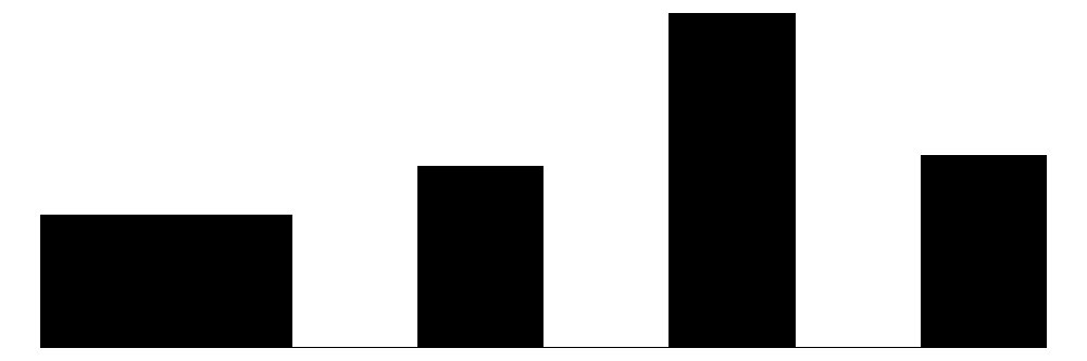
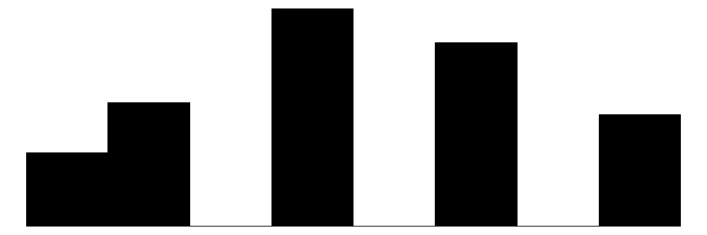
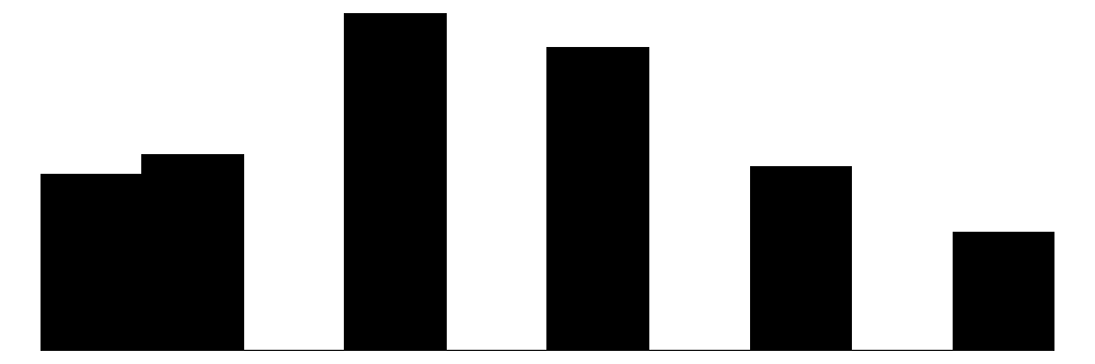
The above chart shows the individual item distributions along with their associated subscales and the standardized collective efficacy scale. Respondents are generally more likely to report higher levels of social cohesion and perceive a high likelihood of neighbors activating social control, but the distributions do vary somewhat.
The top graph shows the overall Collective Efficacy measure, which exhibits a normal-like distribution with some left skew, with values ranging from approximately -4 to +2 on a standardized scale and the bulk of responses falling withing -2 to 2. The distribution peaks slightly above 0, suggesting that the sample trends slightly positive on collective efficacy overall. The social cohesion subscale peaks around 4 (““Somewhat agree”) while the social control subscale, which has 6 potential answer categories, is similarly skewed, peaking around 4-5 (neighbors are “Likely” to “Very Likely” to intervene).
The individual item histograms show response patterns for each question. As with the social cohesion subscale, social cohesion items (purple) generally show values skewed toward higher cohesion responses. This is particularly the case for residents’ perceptions of “Neighbors willing to help” and “Neighbors don’t get along” (reverse coded). The “Close-knit neighborhood” and “Neighbors can be trusted” questions peak at 4 (“Somewhat agree”) whereas “Neighbors don’t share values” (reverse coded) peaks in the middle of the distribution.
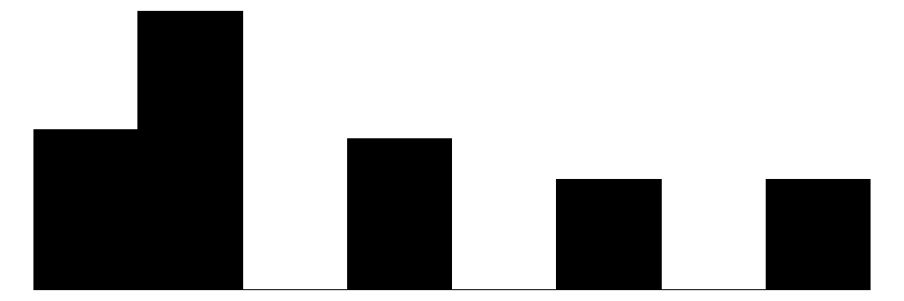
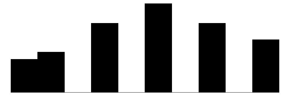
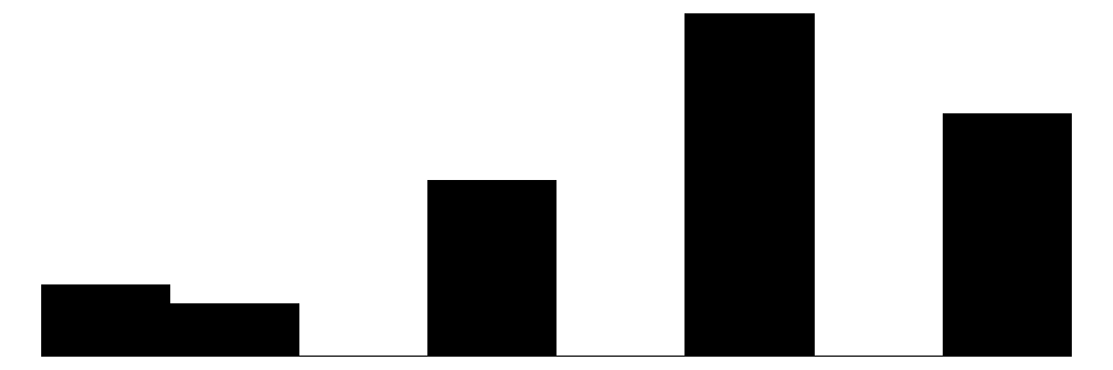
The social control items (yellow) show more varied distributions and more moderate response patterns. For example, for behaviors that are clearly criminal–“Children spray-painting graffiti” and “Break up fight or call police”–respondents generally perceive a high likelihood that their neighbors will intervene (peaks at 6 - “Definitely”). For questions that deal with less serious behavior (“children showing disrespect”) or more individualized with less direct effects on the community (“children skipping school”) responses peak more in the middle of the distribution (3 - 4 = “Unlikely” - “Likely”) while still skewed toward expecting neighbor intervention. Intervening to “keep fire station open” shows a generally positive distribution but perhaps greater uncertainty around how likely it is for neighbors to intervene with relativley similar amounts of respondents reporting values of 4-6 (“Likely”, “Very likely”, “Definitely”).
Overall, residents surveyed perceive their neighborhoods to be relatively cohesive and their neighbors as generally willing to intervene to deal with potential problems in the neighborhood, although they are perhaps less confident depending on the specific issue or behavior in which they are intervening.
5.0.3.2.2 Perceived Neighborhood Violence & Personal Victimization
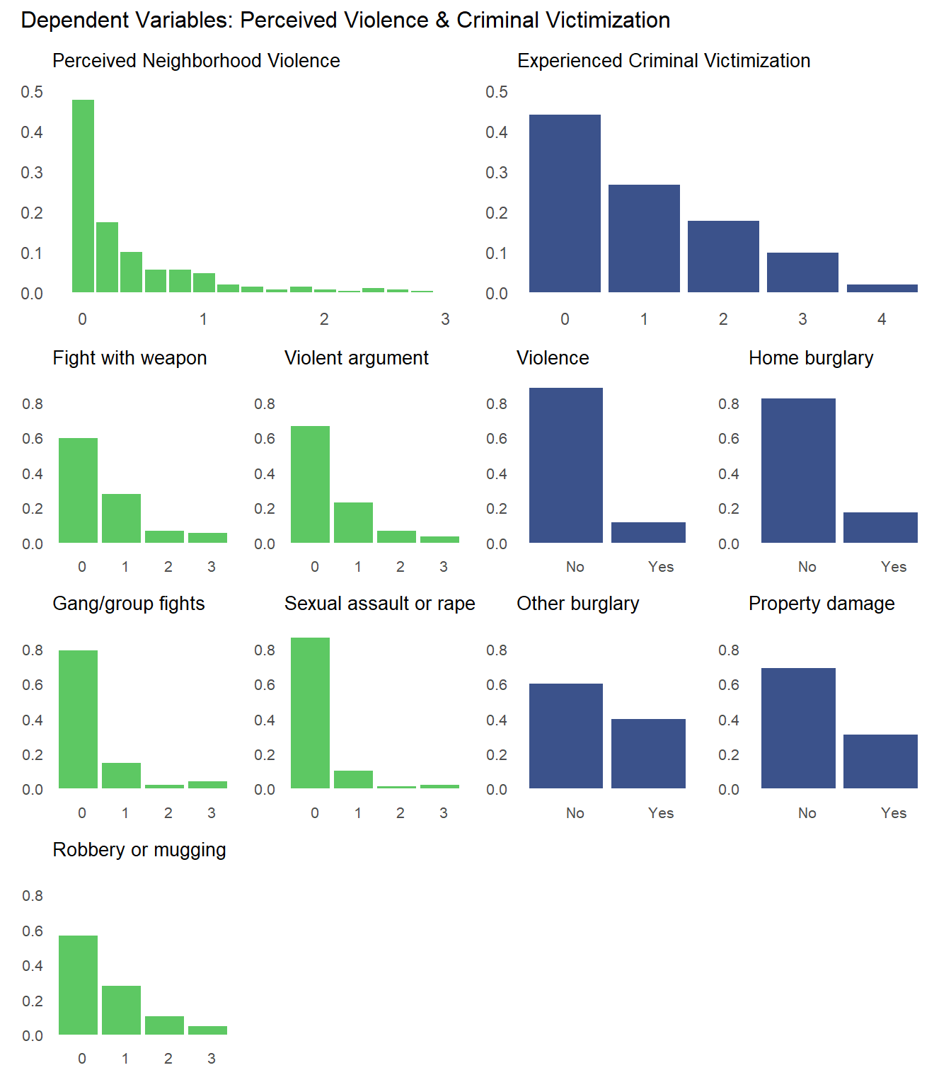
We can produce similar plots for our dependent variables: perceived neighborhood violence and experienced criminal victimization. Similar to the collective efficacy subscales above, we can include them in the same plot alongside the individual items that go into the scales.
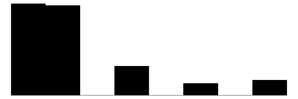
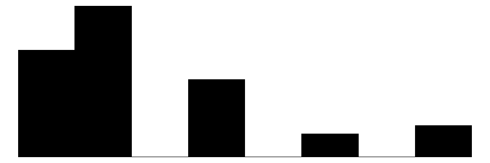
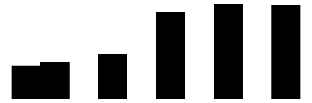
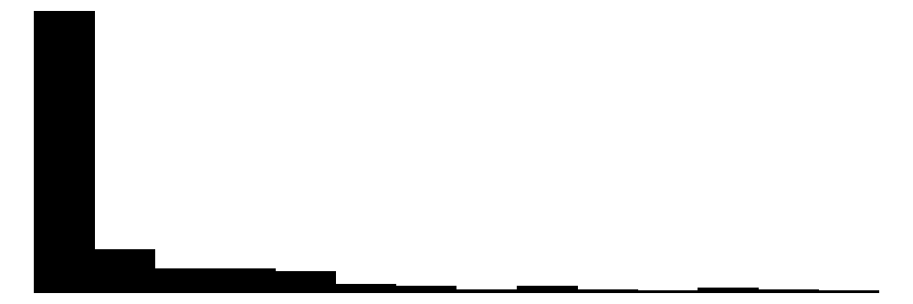
The overall Perceived Neighborhood Violence scale (top left) and experienced criminal victimization scale (top right) both show highly skewed and zero-inflated distributions. Both distributions show a modal response of 0 with progressively fewer respondents reporting higher levels. This is to be expected when dealing with rare events like crime.
When looking at the individual items for the perceived neighborhood violence scale (green color) residents perceive “Fight…in which a weapon was used,” “Violent argument between neighbors,” and “Robbery or mugging” to be less rare than “Gang or group fights” and “Sexual assault or rape.”
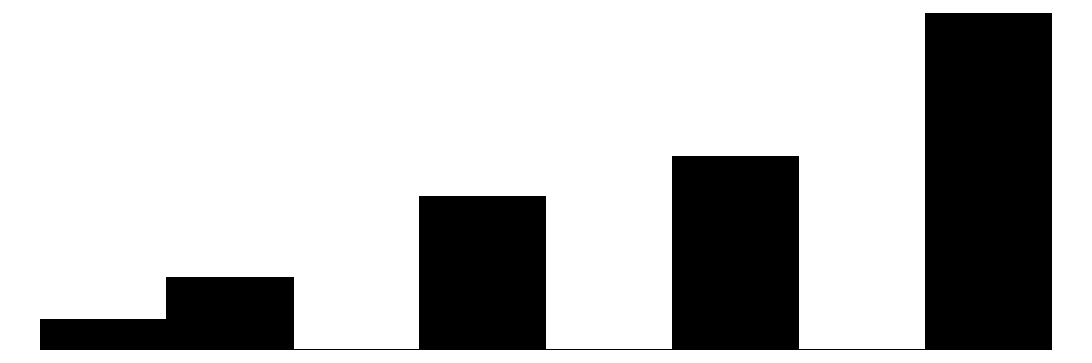
For the experienced criminal victimization items (blue color), the more serious offenses are reported as less often experienced by respondents. Most people (e.g., greater or equal to ~80%) report not experiencing violence (e.g., mugging, fight, or sexual assault) and not experiencing a home burglary (i.e., having their home broken into). More minor offenses such as having things stolen from outside the home (e..g, porch, yard, garage) and having property damaged, were more commonly reported but still relatively rare (~60% - ~70% reported not experiencing it).
5.0.4 Bivariate Mosaic Plots
The above plots show the basic distribution of the specific items that make up the collective efficacy scale as well as the perceived neighborhood violence and personal criminal victimization scales. They provide one with a sense of these Kansas City residents’ perceived connections with their neighbors and their perceptions of their neighbors’ willingness to intervene to solve problems like crime in their neighborhood. They also provide a sense of residents’ perceptions of the amount of violence in their neighborhood and their personal victimization experiences. Although interesting in themselves, we are particularly interested in how these collective efficacy variables are related to perceived neighborhood violence and criminal victimization.
As we discussed recently in a preprint on ordinal modeling (see Brauer and Day, 2025), we often prefer mosaic plots to scatter plots and even to traditional bar charts when visualizing the relationship between ordinal variables with multiple response categories like we have here. Since we have 10 total items for our collective efficacy scale and 9 total items that make up our perceived neighborhood violence and personal victimization scales, that is a total of 90 total plots. To make this more manageable we are going to focus on one dependent variable and one subscale (social cohesion vs. social control) at a time.
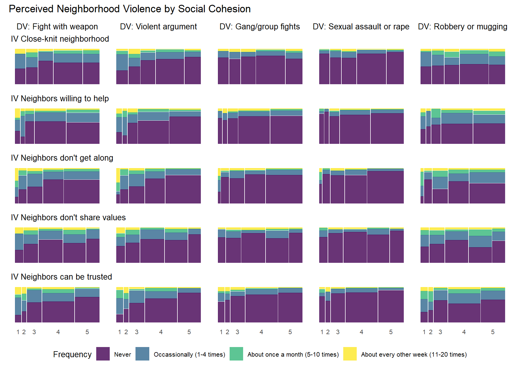
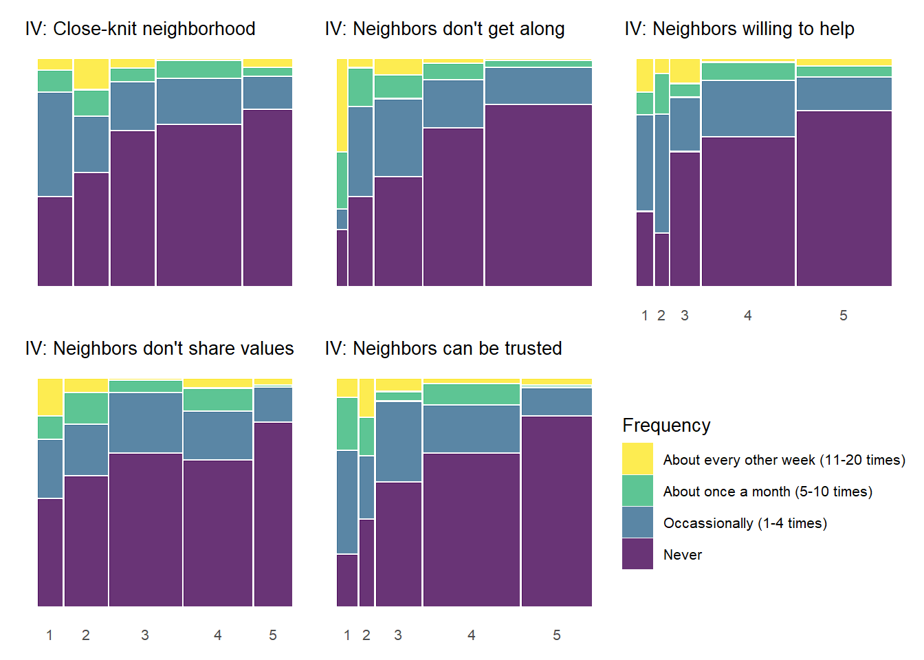
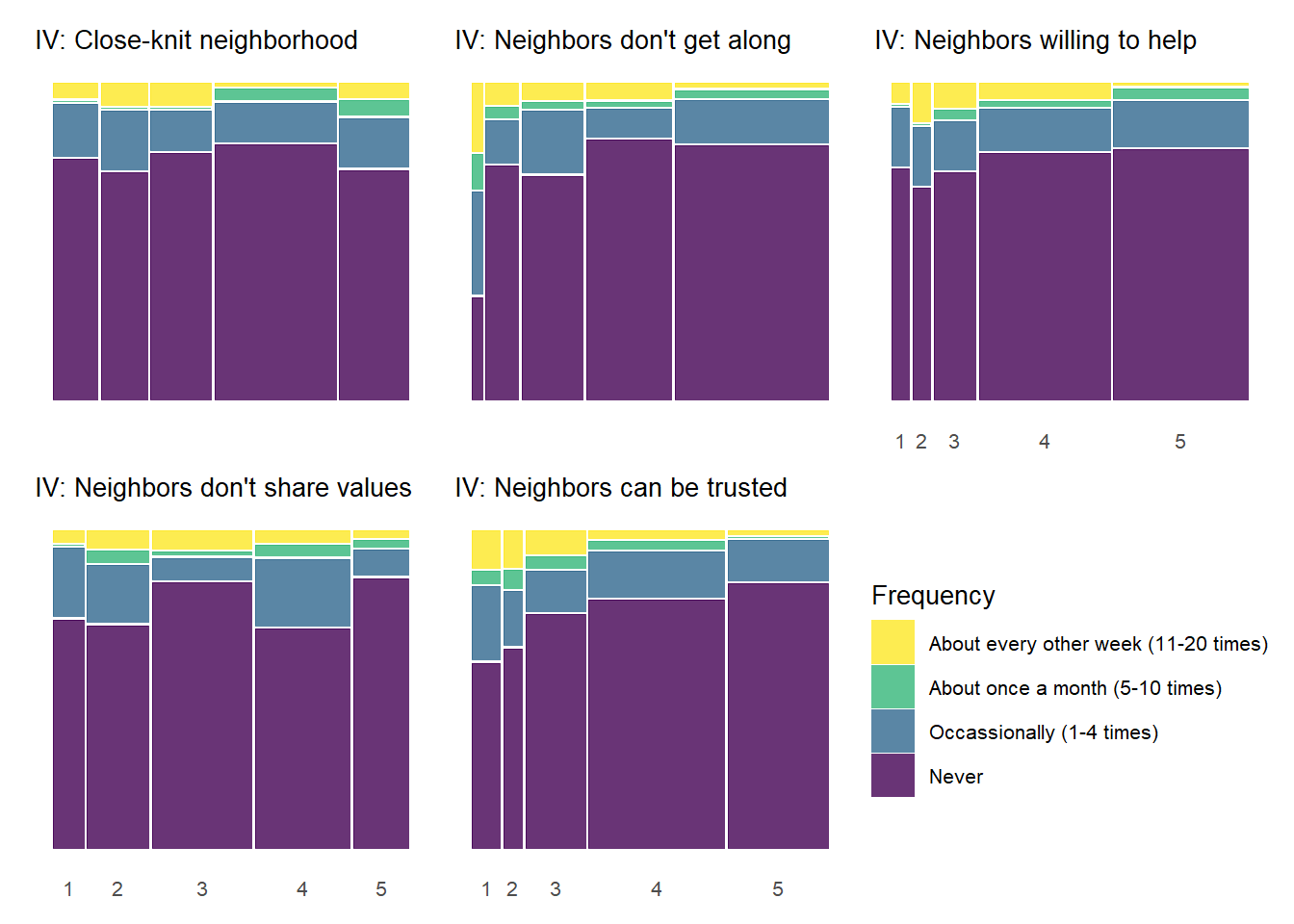
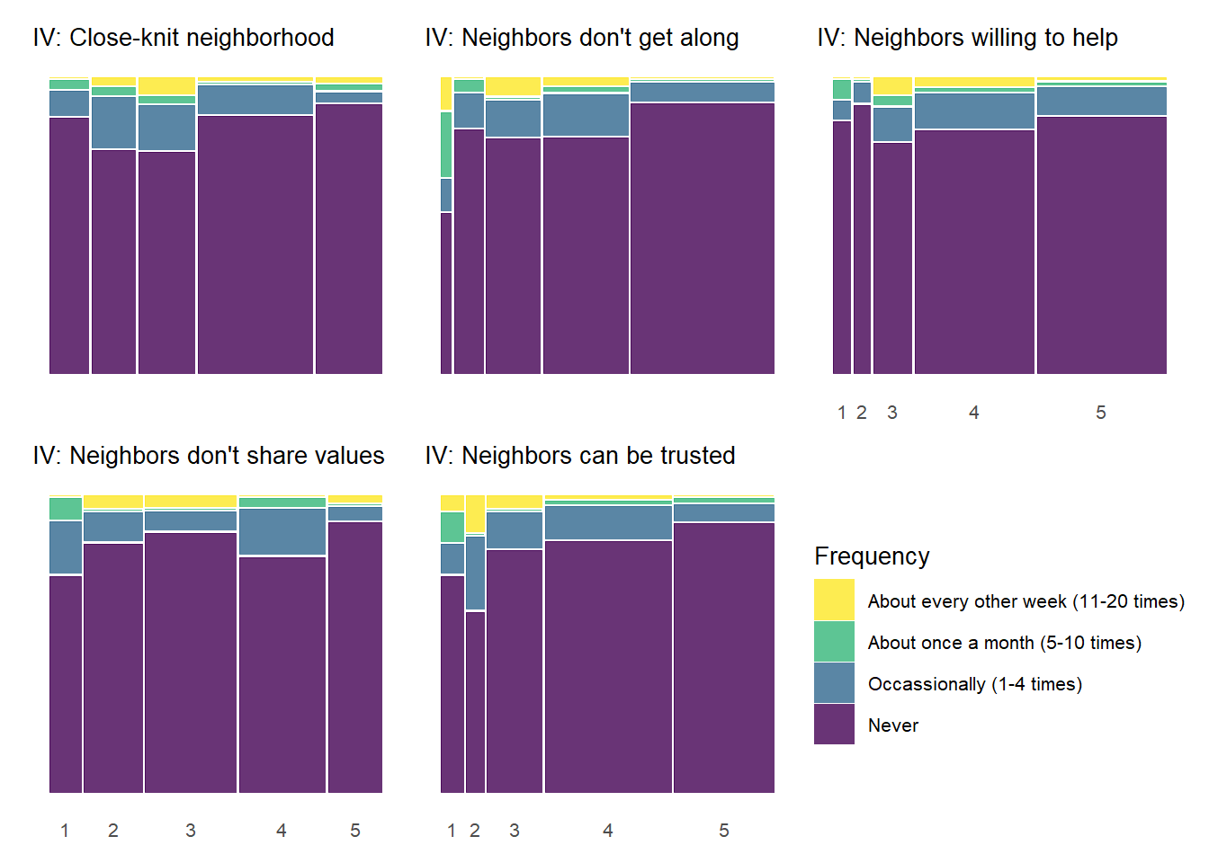
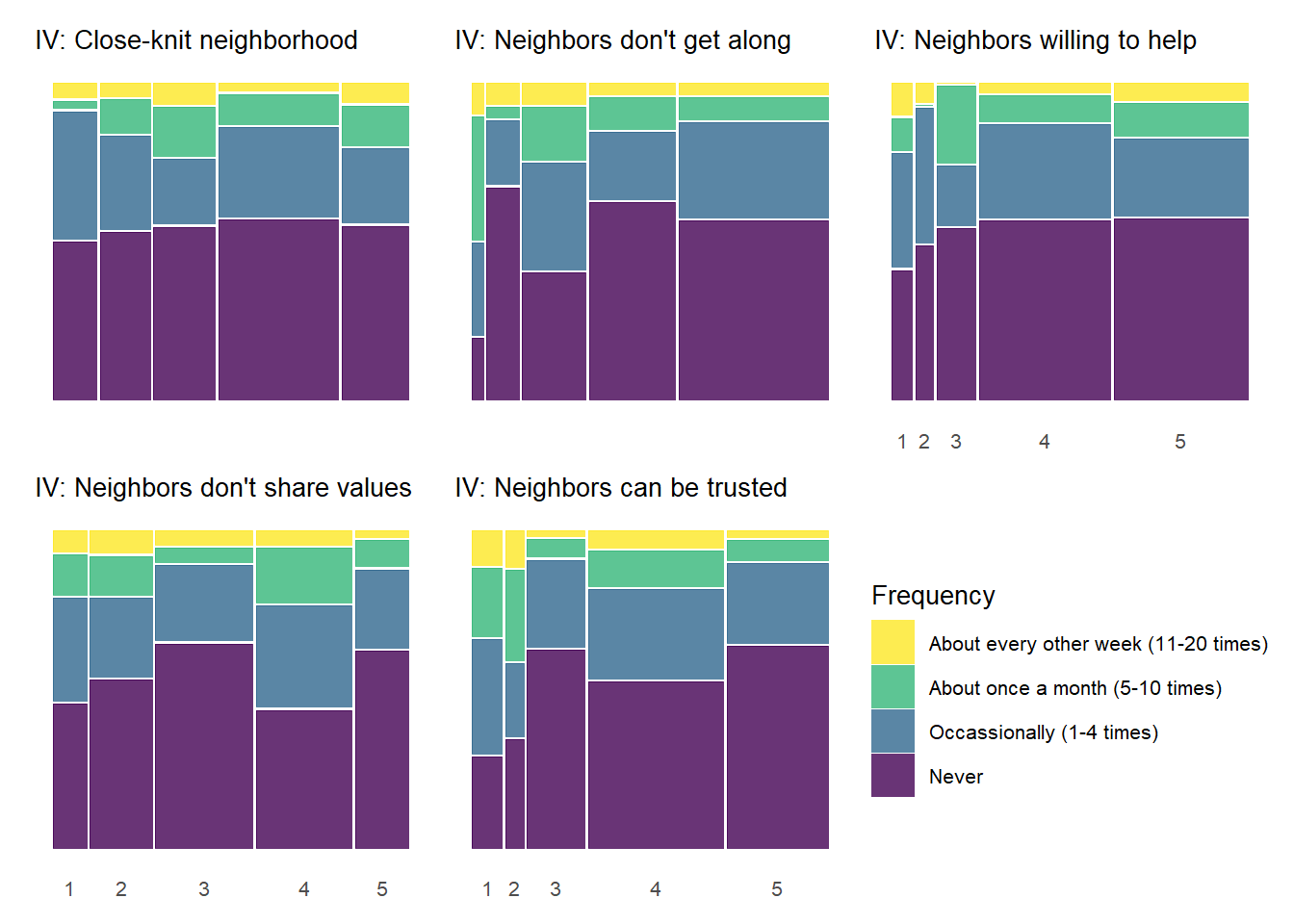
5.0.4.1 Perceived Neighborhood Violence by Social Cohesion
Show code
cohesion_old =c("Q8_2", "Q8_5", "Q8_6", "Q8_11", "Q8_13")cohesion_new =c("closeknit", "helpneigh", "getalong", "shareval", "trustneigh")cohesionz_new =c("closeknit_z", "helpneigh_z", "getalong_z", "shareval_z", "trustneigh_z")control_old =c("Q11_1", "Q11_2", "Q11_3", "Q11_5", "Q11_6")control_new =c("skiphang", "graffiti", "disrespect", "brkupfight", "firestation")controlz_new =c("skiphang_z", "graffiti_z", "disrespect_z", "brkupfight_z", "firestation_z")percviol_old =c(paste0("Q17_", 1:5))percviol_new =c("pv_weapon", "pv_argneigh", "pv_gangfight", "pv_rape", "pv_rob")expcrime_old =c("Q18", "Q18.2", "Q18.4", "Q18.6")expcrime_new =c("exp_viol", "exp_burg", "exp_larc", "exp_dam")cohesion_lab <-c("1"="Strongly Agree","2"="Somewhat Agree","3"="Neither Agree nor Disagree","4"="Somewhat Disagree","5"="Strongly Disagree")control_lab <-c("1"="Definitely","2"="Very Likely","3"="Likely","4"="Unlikely","5"="Very Unlikely","6"="Definitely Not")# Value Labelspercviol_lab <-c("0"="Never","1"="Occassionally (1-4 times)","2"="About once a month (5-10 times)","3"="About every other week (11-20 times)")cohesion_titles =c("Close-knit neighborhood", "Neighbors willing to help", "Neighbors don't get along","Neighbors don't share values", "Neighbors can be trusted")control_titles =c("Children skipping school","Children spray-painting graffiti","Children showing disrespect","Break up fight or call police","Keep fire station open")
Show code
#Function for creating a mosaic plot:basic_mosaic <-function(data, dv, iv, dv_labels, viridis_option ="viridis", title =NULL,subtitle =NULL,title_size =12,subtitle_size =10,x_label_size =8,x_label_angle =0,x_label_hjust =0,x_label_vjust =0,legend_title =NULL,legend_title_size =10,legend_text_size =8,legend_reverse =TRUE) {# Convert string variable names to symbols dv_sym <- rlang::sym(dv) iv_sym <- rlang::sym(iv)# Use rlang's !! (bang-bang) operator to unquote the symbols data %>%ggplot() +geom_mosaic(aes(x =product(!!dv_sym, !!iv_sym), fill =!!dv_sym), na.rm =TRUE) +scale_fill_viridis_d(labels = dv_labels,option = viridis_option ) +guides(fill =guide_legend(reverse = legend_reverse, title = legend_title)) +labs(title = title,subtitle = subtitle ) +theme_minimal() +theme(axis.text.x =element_text(size = x_label_size, vjust = x_label_vjust),axis.text.y =element_blank(),panel.grid =element_blank(),plot.title =element_text(size = title_size, hjust =0.5),plot.subtitle =element_text(size = subtitle_size),axis.title =element_blank(),legend.title =element_text(size = legend_title_size),legend.text =element_text(size = legend_text_size) )}
Since we have 5 perceived violence items and 5 social cohesion items, we have a total of 25 bivariate combinations. We can start by plotting all 25 combinations on one plot and them split them out by specific perceived violence item.
Show code
# Create a data frame with all combinations of variablespvcohesion_combinations <-expand.grid(dv = percviol_new,iv = cohesion_new,stringsAsFactors =FALSE)# Add the titles to the combinationspvcohesion_combinations$dv_title <- percviol_titles[match(pvcohesion_combinations$dv, percviol_new)]pvcohesion_combinations$iv_title <- cohesion_titles[match(pvcohesion_combinations$iv, cohesion_new)]# Add row and column indices as part of the data framepvcohesion_combinations <- pvcohesion_combinations %>%mutate(row_idx =match(iv, cohesion_new),col_idx =match(dv, percviol_new) )# Use pmap to create all 25 plotspvcohesion_plots <-pmap( pvcohesion_combinations, function(dv, iv, dv_title, iv_title, row_idx, col_idx) {# Only include DV title for the first row in each column plot_title <-if(row_idx ==1) paste("DV:", dv_title) elseNULL# Only include IV subtitle for the first column in each row plot_subtitle <-if(col_idx ==1) paste("IV", iv_title) elseNULLbasic_mosaic(data = kc_combsurv_ceanal,dv = dv,iv = iv,dv_labels = percviol_lab,title = plot_title,subtitle = plot_subtitle,title_size =10,legend_title ="Frequency",legend_reverse =FALSE ) })#name the plots for easier reference laternames(pvcohesion_plots) <-paste0(pvcohesion_combinations$dv, "_", pvcohesion_combinations$iv)
Show code
pvcohesion_allplot <-wrap_plots(pvcohesion_plots, ncol =length(percviol_new)) +plot_layout(axes ="collect", guides ="collect") +plot_annotation(title ="Perceived Neighborhood Violence by Social Cohesion") &theme(legend.position ="bottom")pvcohesion_allplot
When examining the above plot, take note of the key characteristics of each mosaic plot. The width of each vertical bar represents the number of respondents at each level of the social cohesion item (1-5) - wider bars mean more respondents answering in that category. Within each bar (or level of the IV), the height of each colored segment represents the proportion of respondents at that IV level who selected each frequency category for perceived violence (“Never” - “About every other week [11-20 times]”).
There are some notable bivariate patterns across the 25 plots presented above. First, there are many relationships that demonstrate threshold effects. This pattern shows relatively high perceived violence at low levels of the social cohesion items that decreases at incrementally higher levels of social cohesion (2 and 3) and then levels off. This pattern is particularly prevelent with the “Fight with weapon” and “Violent argument” perceived violence items, but you see evidence of it with other perceived violence measures as well.
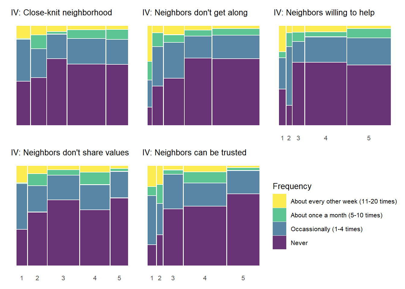
The above plot can perhaps be a bit cumbersome on first glance. Another way to show these plots would be to plot each column of the full 5 by 5 plot above in a separate tab – allowing one to focus on the bivariate relationship for each social cohesion measure with each item in the perceived violence scale.
Show code
# Use pmap to create all 25 plotspvcohesion_plots_wtitle <-pmap( pvcohesion_combinations, function(dv, iv, dv_title, iv_title, row_idx, col_idx) {# Only include DV title for the first row in each column plot_title <-paste("DV:", dv_title)# Only include IV subtitle for the first column in each row plot_subtitle <-paste("IV:", iv_title)basic_mosaic(data = kc_combsurv_ceanal,dv = dv,iv = iv,dv_labels = percviol_lab,title = plot_title,subtitle = plot_subtitle,title_size =10,legend_title ="Frequency",legend_reverse =TRUE ) })#name the plots for easier reference laternames(pvcohesion_plots_wtitle) <-paste0(pvcohesion_combinations$dv, "_", pvcohesion_combinations$iv)
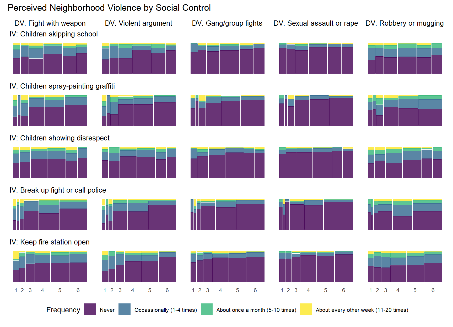
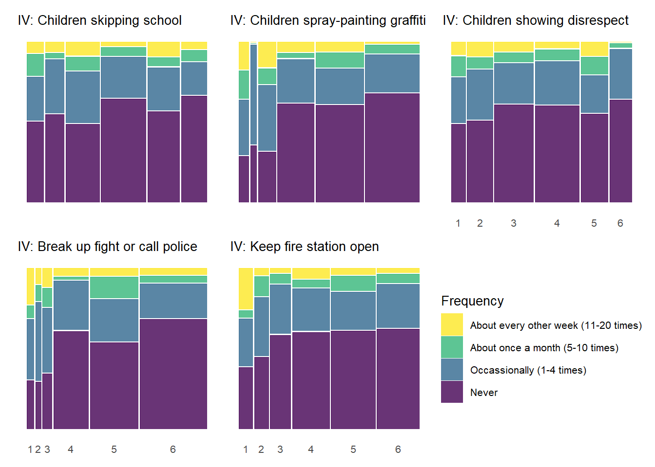
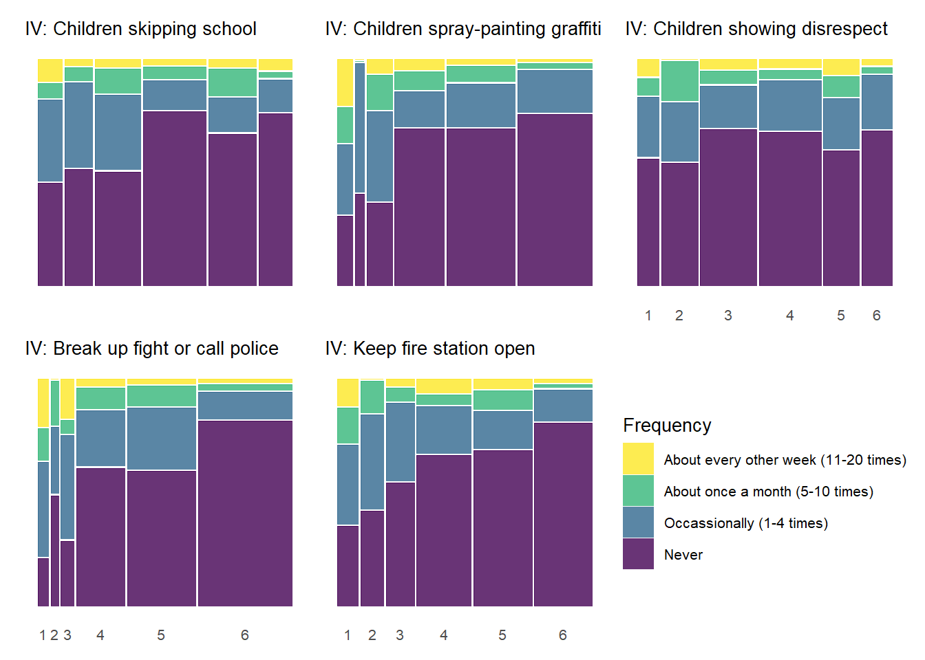
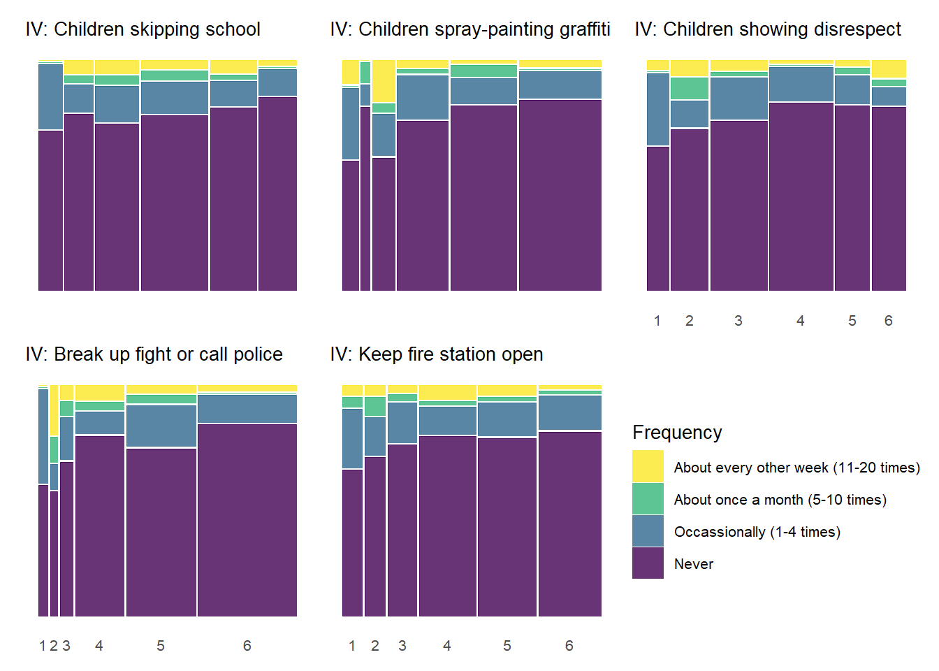
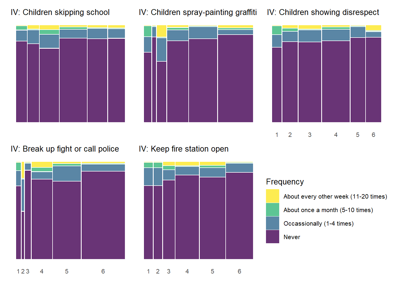
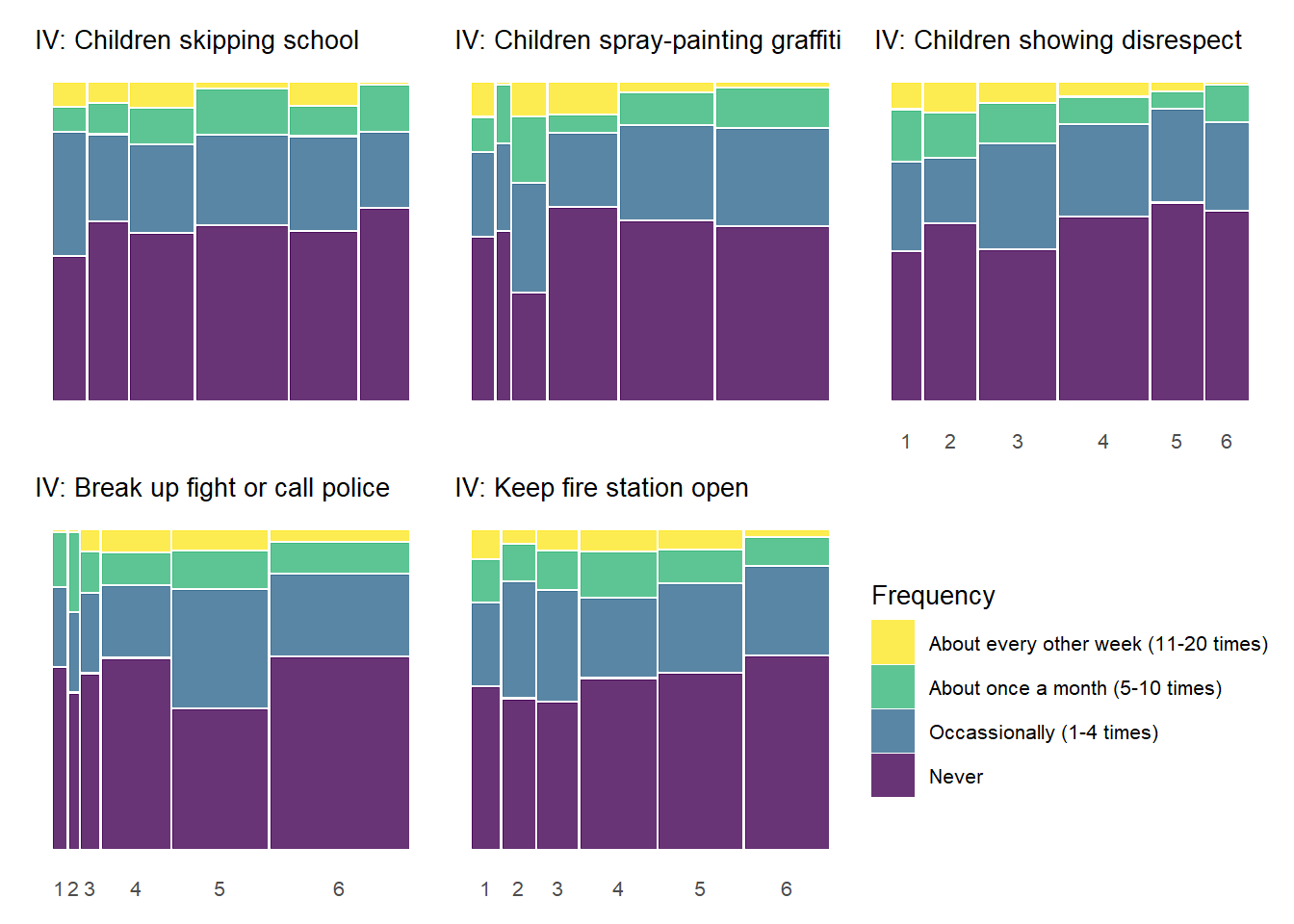
5.0.4.2 Perceived Neighborhood Violence by Informal Social Control
Below we produce similar plots for the social control variables.
Show code
# Create a data frame with all combinations of variablespvcontrol_combinations <-expand.grid(dv = percviol_new,iv = control_new,stringsAsFactors =FALSE)# Add the titles to the combinationspvcontrol_combinations$dv_title <- percviol_titles[match(pvcontrol_combinations$dv, percviol_new)]pvcontrol_combinations$iv_title <- control_titles[match(pvcontrol_combinations$iv, control_new)]# Add row and column indices as part of the data framepvcontrol_combinations <- pvcontrol_combinations %>%mutate(row_idx =match(iv, control_new),col_idx =match(dv, percviol_new) )# Use pmap to create all 25 plotspvcontrol_plots <-pmap( pvcontrol_combinations, function(dv, iv, dv_title, iv_title, row_idx, col_idx) {# Only include DV title for the first row in each column plot_title <-if(row_idx ==1) paste("DV:", dv_title) elseNULL# Only include IV subtitle for the first column in each row plot_subtitle <-if(col_idx ==1) paste("IV:", iv_title) elseNULLbasic_mosaic(data = kc_combsurv_ceanal,dv = dv,iv = iv,dv_labels = percviol_lab,title = plot_title,subtitle = plot_subtitle,title_size =10,legend_title ="Frequency",legend_reverse =FALSE ) })#name the plots for easier reference laternames(pvcontrol_plots) <-paste0(pvcontrol_combinations$dv, "_", pvcontrol_combinations$iv)
Show code
pvcontrol_allplot <-wrap_plots(pvcontrol_plots, ncol =length(percviol_new)) +plot_layout(axes ="collect", guides ="collect") +plot_annotation(title ="Perceived Neighborhood Violence by Social Control") &theme(legend.position ="bottom")pvcontrol_allplot
As with the previous plot showing the relationships between social cohesion items and perceived violence, the above chart documents similar, although perhaps less common, threshold effects between social control items and perceived violence. Respondents generally report more perceived violence at lower levels of the social control items and less perceived violence at higher levels of social control. The “Keep fire station open” social control variable shows the most pronounced threshold effects similar to many of the social cohesion items in the previous charts. With many of the other the social control items, the difference in perceived violence between gradations of low social control (1 - 3) is less pronounced.
Show code
# Use pmap to create all 25 plotspvcontrol_plots_wtitle <-pmap( pvcontrol_combinations, function(dv, iv, dv_title, iv_title, row_idx, col_idx) { plot_title <-paste("DV:", dv_title) plot_subtitle <-paste("IV:", iv_title)basic_mosaic(data = kc_combsurv_ceanal,dv = dv,iv = iv,dv_labels = percviol_lab,title = plot_title,subtitle = plot_subtitle,title_size =10,legend_title ="Frequency",legend_reverse =TRUE ) })#name the plots for easier reference laternames(pvcontrol_plots_wtitle) <-paste0(pvcontrol_combinations$dv, "_", pvcontrol_combinations$iv)
5.0.4.3 Experienced Criminal Victimization by Social Cohesion
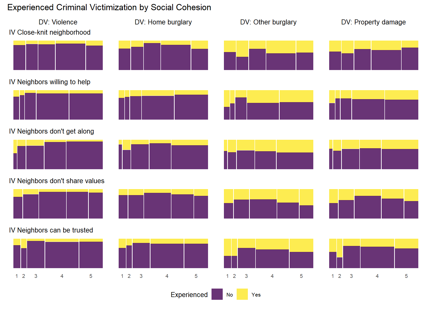
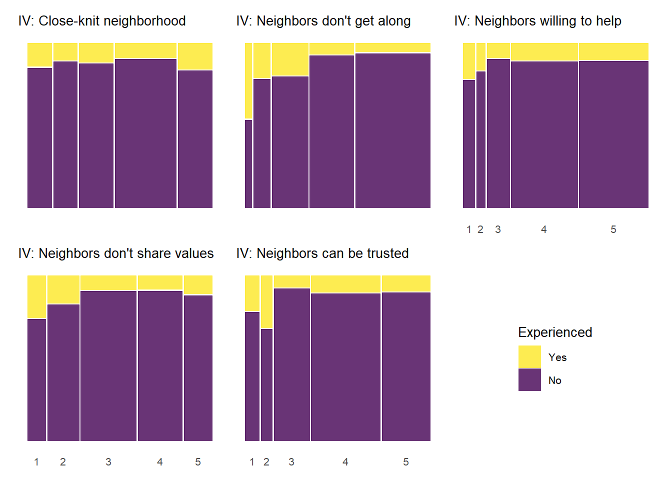
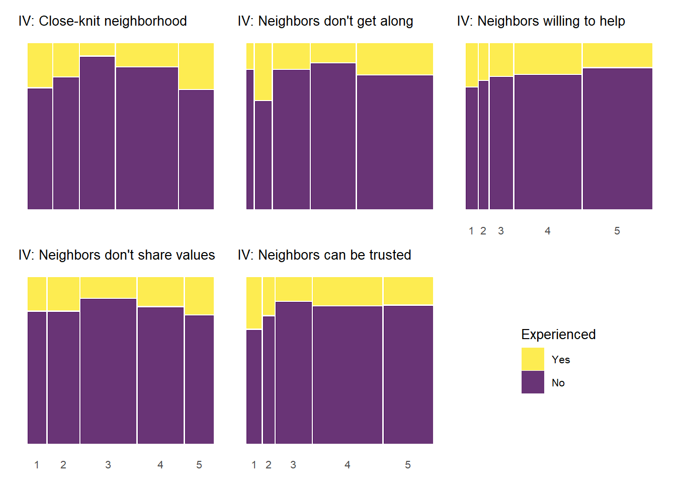
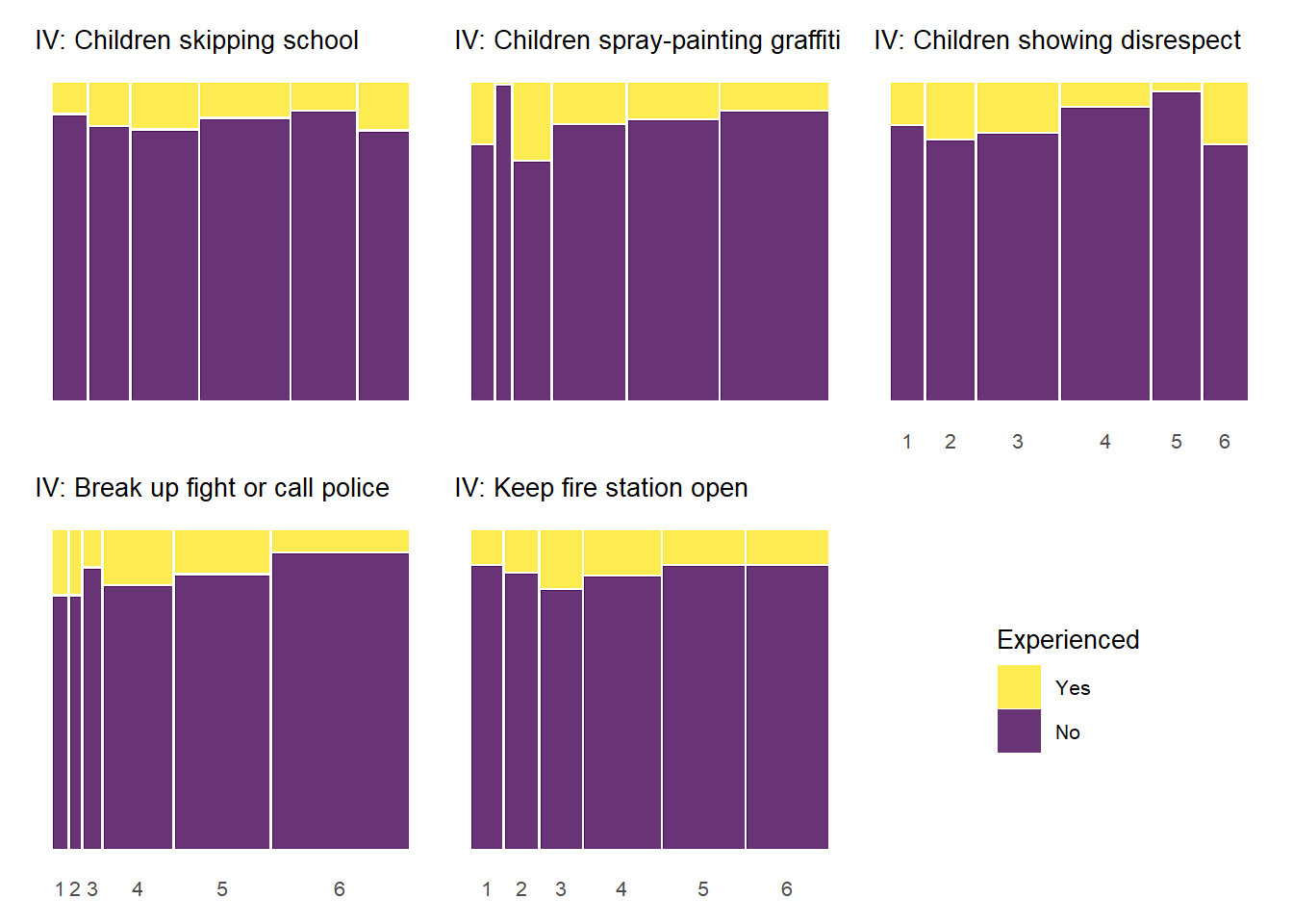
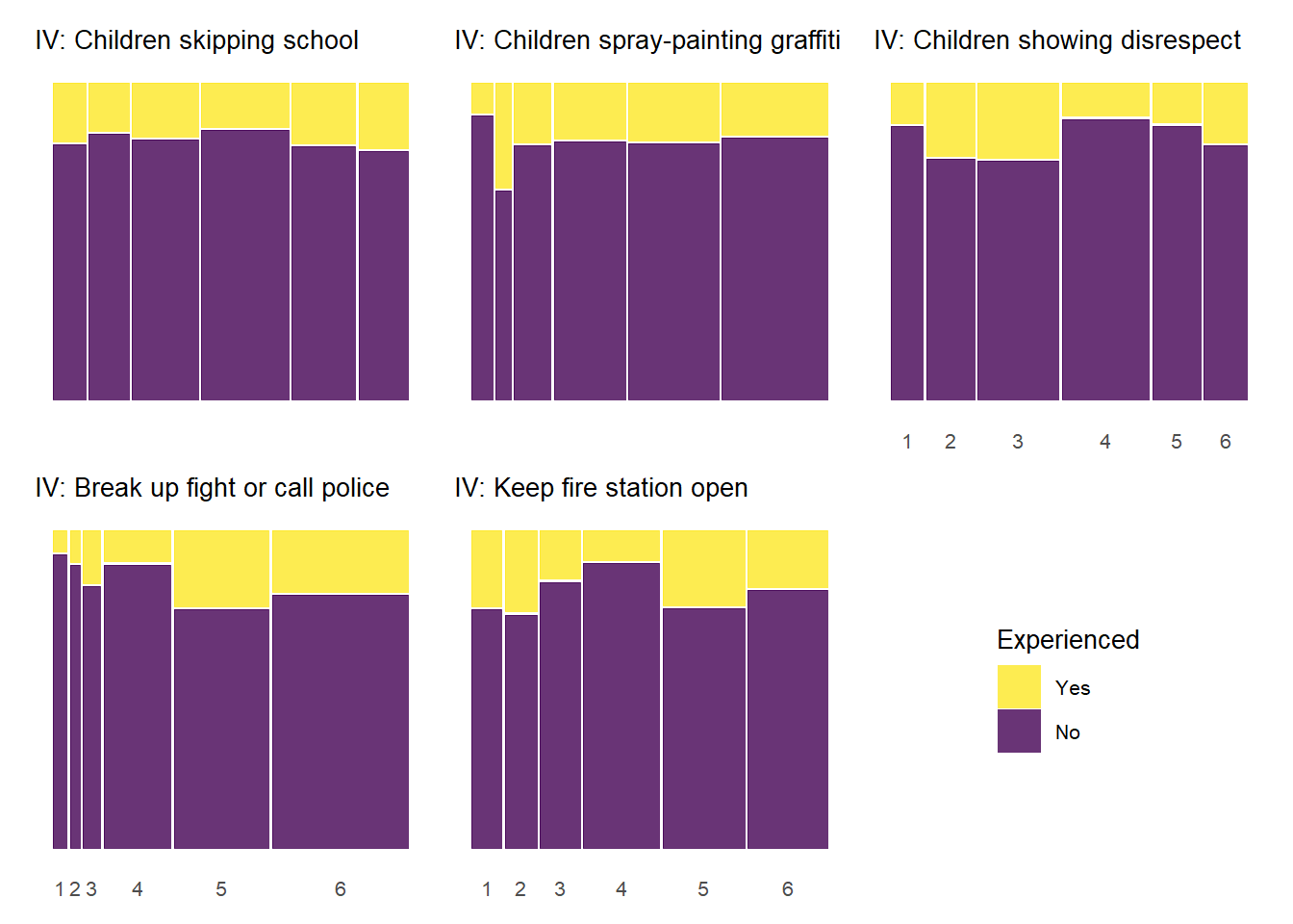
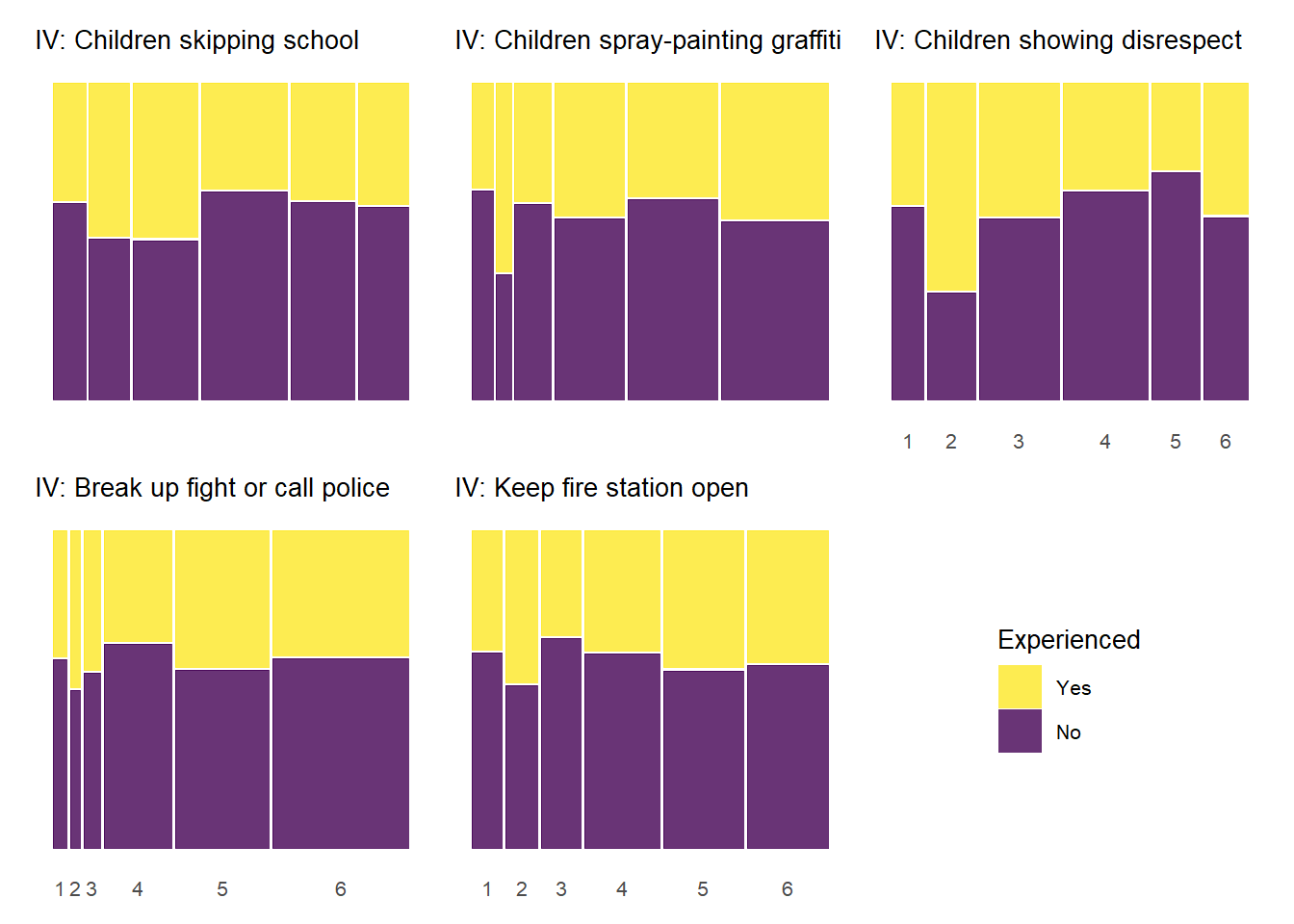
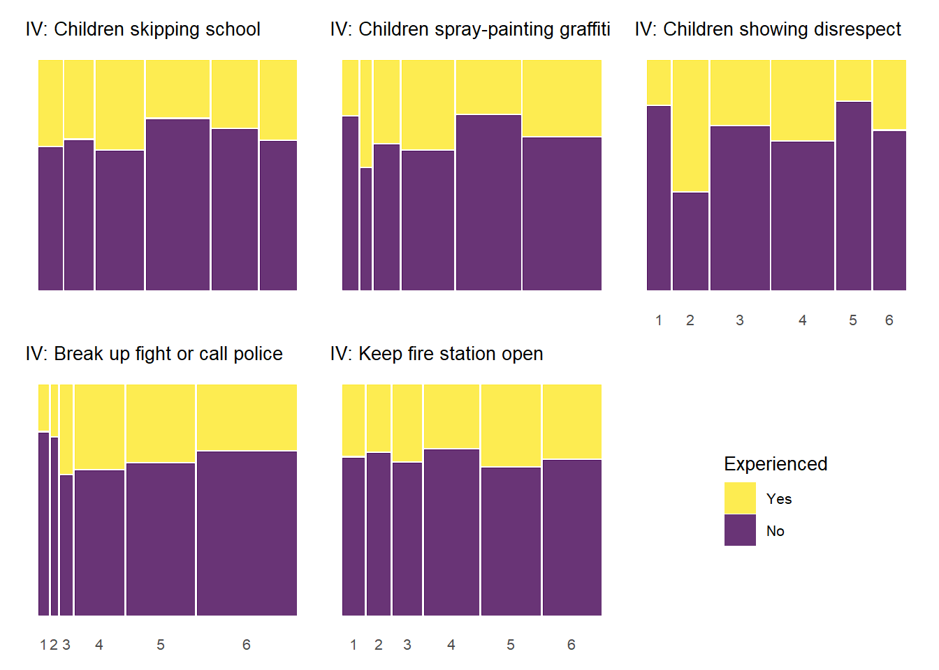
Below, we produce mosaic plots for the relationship between our four experienced criminal victimization items and the items that make up the social cohesion and social control scales respectively. Note that the experienced victimization items are dichotomous and thus their are only two colors in the chart representing the proportion of “yes” (yellow) and “no” (purple) responses to the experienced victimization questions.
Show code
# Create a data frame with all combinations of variablesevcohesion_combinations <-expand.grid(dv = expcrime_new,iv = cohesion_new,stringsAsFactors =FALSE)# Add the titles to the combinationsevcohesion_combinations$dv_title <- expcrime_titles[match(evcohesion_combinations$dv, expcrime_new)]evcohesion_combinations$iv_title <- cohesion_titles[match(evcohesion_combinations$iv, cohesion_new)]# Add row and column indices as part of the data frameevcohesion_combinations <- evcohesion_combinations %>%mutate(row_idx =match(iv, cohesion_new),col_idx =match(dv, expcrime_new) )# Use pmap to create all 25 plotsevcohesion_plots <-pmap( evcohesion_combinations, function(dv, iv, dv_title, iv_title, row_idx, col_idx) {# Only include DV title for the first row in each column plot_title <-if(row_idx ==1) paste("DV:", dv_title) elseNULL# Only include IV subtitle for the first column in each row plot_subtitle <-if(col_idx ==1) paste("IV", iv_title) elseNULLbasic_mosaic(data = kc_combsurv_ceanal,dv = dv,iv = iv,dv_labels = expcrime_lab,title = plot_title,subtitle = plot_subtitle,title_size =10,legend_title ="Experienced",legend_reverse =FALSE ) })#name the plots for easier reference laternames(evcohesion_plots) <-paste0(evcohesion_combinations$dv, "_", evcohesion_combinations$iv)
Show code
evcohesion_allplot <-wrap_plots(evcohesion_plots, ncol =length(expcrime_new)) +plot_layout(axes ="collect", guides ="collect") +plot_annotation(title ="Experienced Criminal Victimization by Social Cohesion") &theme(legend.position ="bottom")evcohesion_allplot
The above plots generally follow a pattern where higher levels of social cohesion are associated with a lower likelihood of reporting victimization experiences. There is also some evidence of threshold effects similar to the relationship between social cohesion and perceived violence above. An interesting, although not common, pattern documented in the plots above is that some cohesion-victimization combinations show a slight increase in victimization expreiences after the middle value on the social cohesion items scale (3 = “neither agree or disagree”) – e.g., “Neighbors don’t share values” by “Property damage;” “Close-knit neighborhood” by “Home burglary”.
Show code
# Use pmap to create all 25 plotsevcohesion_plots_wtitle <-pmap( evcohesion_combinations, function(dv, iv, dv_title, iv_title, row_idx, col_idx) { plot_title <-paste("DV:", dv_title) plot_subtitle <-paste("IV:", iv_title)basic_mosaic(data = kc_combsurv_ceanal,dv = dv,iv = iv,dv_labels = expcrime_lab,title = plot_title,subtitle = plot_subtitle,title_size =10,legend_title ="Experienced",legend_reverse =TRUE ) })#name the plots for easier reference laternames(evcohesion_plots_wtitle) <-paste0(evcohesion_combinations$dv, "_", evcohesion_combinations$iv)
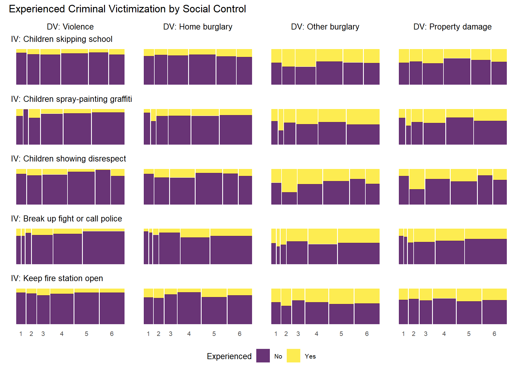
5.0.4.4 Experienced Criminal Victimization by Informal Social Control
Finally, let’s do the same thing with the informal social control items.
Show code
# Create a data frame with all combinations of variablesevcontrol_combinations <-expand.grid(dv = expcrime_new,iv = control_new,stringsAsFactors =FALSE)# Add the titles to the combinationsevcontrol_combinations$dv_title <- expcrime_titles[match(evcontrol_combinations$dv, expcrime_new)]evcontrol_combinations$iv_title <- control_titles[match(evcontrol_combinations$iv, control_new)]# Add row and column indices as part of the data frameevcontrol_combinations <- evcontrol_combinations %>%mutate(row_idx =match(iv, control_new),col_idx =match(dv, expcrime_new) )# Use pmap to create all 25 plotsevcontrol_plots <-pmap( evcontrol_combinations, function(dv, iv, dv_title, iv_title, row_idx, col_idx) {# Only include DV title for the first row in each column plot_title <-if(row_idx ==1) paste("DV:", dv_title) elseNULL# Only include IV subtitle for the first column in each row plot_subtitle <-if(col_idx ==1) paste("IV:", iv_title) elseNULLbasic_mosaic(data = kc_combsurv_ceanal,dv = dv,iv = iv,dv_labels = expcrime_lab,title = plot_title,subtitle = plot_subtitle,title_size =10,legend_title ="Experienced",legend_reverse =FALSE ) })#name the plots for easier reference laternames(evcontrol_plots) <-paste0(evcontrol_combinations$dv, "_", evcontrol_combinations$iv)
Show code
evcontrol_allplot <-wrap_plots(evcontrol_plots, ncol =length(expcrime_new)) +plot_layout(axes ="collect", guides ="collect") +plot_annotation(title ="Experienced Criminal Victimization by Social Control") &theme(legend.position ="bottom")evcontrol_allplot
As with the previous plots, the relationship between informal social control and experienced victimization at the item-level generally follows a pattern of higher levels of perceived social control in one’s neighborhood being associated with less victimizaiton experiences. Of course, this basic relationship is perhaps less consistent with regards to social control than it was for social cohesion. There is also some evidence of threshold effects as in previous plots, but not as clear or prevalent as with other relationships. Also, while there is some evidence of spikes in not experiencing criminal victimization at the middle values of informal social control (e.g., “Children skipping schoo” by “Gang/group fights”), there is also some evidence of spikes in non-victimization at the low end informal social control (e.g., “Children showing disrespect” by “Sexual assault or rape”; “Break up fight or call police” by “Violent argument”). These lower-level spikes are usually more noisy estimates as they often reflect small subsamples of respondents who reported one or two of these lower-level answers for perceived social control.
Show code
# Use pmap to create all 25 plotsevcontrol_plots_wtitle <-pmap( evcontrol_combinations, function(dv, iv, dv_title, iv_title, row_idx, col_idx) { plot_title <-paste("DV:", dv_title) plot_subtitle <-paste("IV:", iv_title)basic_mosaic(data = kc_combsurv_ceanal,dv = dv,iv = iv,dv_labels = expcrime_lab,title = plot_title,subtitle = plot_subtitle,title_size =10,legend_title ="Experienced",legend_reverse =TRUE ) })#name the plots for easier reference laternames(evcontrol_plots_wtitle) <-paste0(evcontrol_combinations$dv, "_", evcontrol_combinations$iv)
The mosaic plots above help us visualize the bivariate relationships between perceived or experienced crime and each of the items used to measure latent collective efficacy and its constituent sub-dimensions (control and cohesion). For readers new to this type of visualization, it may take some getting used to. But, once you look at enough mosaic plots, you should start getting a quick sense of the patterns of relationships between the variables presented. Of course, many readers are used to a summary statistic or correlation coefficient to describe bivariate relationships between two variables. This can also be helpful in considering the internal consistency of items used to measure key constructs, a practice common throughout criminology and used by Sampson and colleagues in their collective efficacy research.
Below, we calculate correlation coefficients meant for categorical data (polychoric, Spearman’s rho) and use them to produce a set of correlation matrices as well as a Manhattan plot. We also compare these ordinal/categorical measures of association to the traditional linear measure of correlation - Pearson’s r.
5.0.5.1 Correlation Matrices
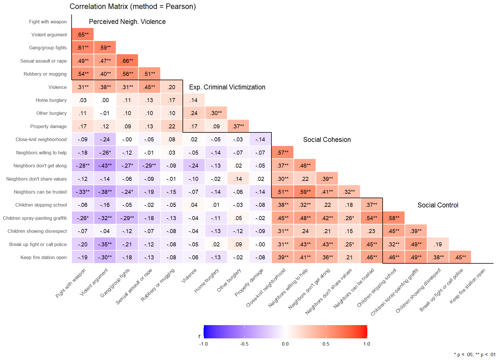
Below, we produce a correlation matrix that includes each of the specific items described above. In doing this, we calculate both Polychoric correlation coefficients (rho) and Pearson’s correlation coefficients (r). Polychoric correlation treats the ordinal items similar to ordinal probit models by assuming the answers to the items result from discretizing an underlying continuous bivariate normal distribution. We show the Pearson’s correlation matrix so the reader can see how applying a linear model and assumptions to ordinal data tends to underestimate the size of the associations relative to model estimates designed for ordinal data.
Show code
#Use the `correlation` function from easystat's "Correlation" function (https://easystats.github.io/correlation/index.html) #to calculaate the bivariate correlations between all of our items and scales described above. #Then produce a correlation matrix for each.# Vectors of items and item labels:all_items =c(percviol_new, expcrime_new, cohesion_new, control_new)all_itemslabs =c(percviol_titles, expcrime_titles, cohesion_titles, control_titles)label_map <-setNames(all_itemslabs, all_items)# Prepare data with consistent missing value handlingcorrelation_data <- kc_combsurv_ceanal %>%select(all_of(all_items)) %>%drop_na()# Polychoric Correlation Data (needs factors)allitems_poly <- correlation_data %>%mutate(across(everything(), ~factor(.x, ordered =TRUE))) %>%correlation(method ="polychoric") %>%as_tibble() %>%mutate(psig =ifelse(p < .05& p >= .01, "*", ""),psig =ifelse(p < .01, "**", psig),r_format_round =sprintf("%.2f", rho),r_format =ifelse(r_format_round !=0.00, sub("^(-?)0(\\.\\d+)$", "\\1\\2", r_format_round), r_format_round),r_sig =paste0(r_format, psig),Parameter1_lab =recode(Parameter1, !!!label_map),Parameter2_lab =recode(Parameter2, !!!label_map) ) # Pearson Correlation Data (keep as numeric - DON'T convert to factors)allitems_pears <- correlation_data %>%# Remove the factor conversion line for Pearsoncorrelation(method ="pearson") %>%as_tibble() %>%mutate(psig =ifelse(p < .05& p >= .01, "*", ""),psig =ifelse(p < .01, "**", psig),r_format_round =sprintf("%.2f", r),r_format =ifelse(r_format_round !=0.00, sub("^(-?)0(\\.\\d+)$", "\\1\\2", r_format_round), r_format_round),r_sig =paste0(r_format, psig),Parameter1_lab =recode(Parameter1, !!!label_map),Parameter2_lab =recode(Parameter2, !!!label_map) )
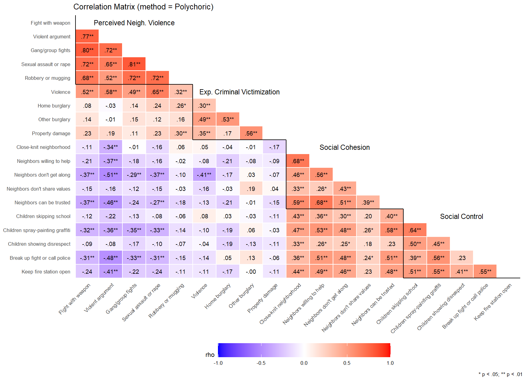
ggplot(allitems_poly, aes(x = Parameter1_lab, y = Parameter2_lab, fill = rho)) +geom_tile(color ="white", linewidth =0.5) +scale_fill_gradient2(low ="blue", mid ="white", high ="red",limits =c(-1, 1), name ="rho", na.value ="grey80") +# Handle NAs in fillgeom_text(ggplot2::aes(label = r_sig), size =7/ .pt) +scale_x_discrete(limits = all_itemslabs, drop =FALSE) +scale_y_discrete(limits =rev(all_itemslabs), drop =FALSE) +theme_minimal(base_size =8) +labs(title ="Correlation Matrix (method = Polychoric)",caption ="* p < .05; ** p < .01") +geom_segment(aes(x =0.5, xend =5.5, y =14.5, yend =14.5), color ="black", linewidth = .5) +geom_segment(aes(x =0.5, xend =0.5, y =14.5, yend =19.5), color ="black", linewidth = .5) +geom_segment(aes(x =5.5, xend =9.5, y =10.5, yend =10.5), color ="black", linewidth = .5) +geom_segment(aes(x =5.5, xend =5.5, y =10.5, yend =14.5), color ="black", linewidth = .5) +geom_segment(aes(x =9.5, xend =14.5, y =5.5, yend =5.5), color ="black", linewidth = .5) +geom_segment(aes(x =9.5, xend =9.5, y =5.5, yend =10.5), color ="black", linewidth = .5) +geom_segment(aes(x =14.5, xend =19.5, y =0.5, yend =0.5), color ="black", linewidth = .5) +geom_segment(aes(x =14.5, xend =14.5, y =0.5, yend =5.5), color ="black", linewidth = .5) +annotate("text", x =3, y =19, size =3, label ="Perceived Neigh. Violence") +annotate("text", x =7.5, y =14, size =3, label ="Exp. Criminal Victimization") +annotate("text", x =12, y =10, size =3, label ="Social Cohesion") +annotate("text", x =17, y =5, size =3, label ="Social Control") +theme(panel.grid = ggplot2::element_blank(),axis.title.x = ggplot2::element_blank(),axis.title.y = ggplot2::element_blank(),axis.text.x = ggplot2::element_text(angle =45, hjust =1),legend.position ="bottom",legend.key.width = ggplot2::unit(1.5, "cm") )
Show code
ggplot(allitems_pears, aes(x = Parameter1_lab, y = Parameter2_lab, fill = r)) +geom_tile(color ="white", linewidth =0.5) +scale_fill_gradient2(low ="blue", mid ="white", high ="red",limits =c(-1, 1), name ="r", na.value ="grey80") +# Handle NAs in fillgeom_text(ggplot2::aes(label = r_sig), size =7/ .pt) +scale_x_discrete(limits = all_itemslabs, drop =FALSE) +scale_y_discrete(limits =rev(all_itemslabs), drop =FALSE) +theme_minimal(base_size =8) +labs(title ="Correlation Matrix (method = Pearson)",caption ="* p < .05; ** p < .01") +geom_segment(aes(x =0.5, xend =5.5, y =14.5, yend =14.5), color ="black", linewidth = .5) +geom_segment(aes(x =0.5, xend =0.5, y =14.5, yend =19.5), color ="black", linewidth = .5) +geom_segment(aes(x =5.5, xend =9.5, y =10.5, yend =10.5), color ="black", linewidth = .5) +geom_segment(aes(x =5.5, xend =5.5, y =10.5, yend =14.5), color ="black", linewidth = .5) +geom_segment(aes(x =9.5, xend =14.5, y =5.5, yend =5.5), color ="black", linewidth = .5) +geom_segment(aes(x =9.5, xend =9.5, y =5.5, yend =10.5), color ="black", linewidth = .5) +geom_segment(aes(x =14.5, xend =19.5, y =0.5, yend =0.5), color ="black", linewidth = .5) +geom_segment(aes(x =14.5, xend =14.5, y =0.5, yend =5.5), color ="black", linewidth = .5) +annotate("text", x =3, y =19, size =3, label ="Perceived Neigh. Violence") +annotate("text", x =7.5, y =14, size =3, label ="Exp. Criminal Victimization") +annotate("text", x =12, y =10, size =3, label ="Social Cohesion") +annotate("text", x =17, y =5, size =3, label ="Social Control") +theme(panel.grid = ggplot2::element_blank(),axis.title.x = ggplot2::element_blank(),axis.title.y = ggplot2::element_blank(),axis.text.x = ggplot2::element_text(angle =45, hjust =1),legend.position ="bottom",legend.key.width = ggplot2::unit(1.5, "cm") )
The above correlation matrices can be a bit cumbersome to look at. To aid in interpretation, we have labeled the items with the scale or latent construct they are meant to measure. Correlation coefficients above the jagged or stepped dark line and below the labels are inter-item correlations for each respective construct. As you can see in the table of polychoric correlations, inter-item correlations are relatively large for items measuring the same construct. This is especially the case for the “perceived neighborhood violence” measures with inter-item correlations ranging from 0.53 to 0.84. Inter-item correlations are smallest for the the “Experienced criminal victimization” items, with rho values ranging from 0.20 to 0.61. You can also see relatively strong correlation within and between the items meant to measure “social cohesion” and “social control,” or both sub-scales of the latent “collective efficacy” measure.
5.0.6 Item-total correlations
To get a better sense of how each of these items contributes to their respective scales and how each item of the collective efficacy scale correlates with the crime measures, I am going to try to produce some “Manhattan”-style plots of item-total correlations (for the scales) and bivariate correlations (for the relationship between collective efficacy items and crime measures).
First, let’s start with the item-total correlations. These are “corrected” item-total correlations that simply measure each item’s correlation to the composite scale created without that specific item. This is a basic psychometric approach for assessing how well each item aligns with a measure of the latent construct. Traditionally, researchers report item-total correlations for Pearson’s r values, even when they are examining ordinal variables. Below, we calculate item-total correlations using polychoric correlation coefficients (and tetrachoric for dichotomous items) given the potential issues of applying metric models to ordinal data (see Brauer and Day, 2025).
Show code
### Function to produce simple data set of item-total correlations using psych::polychoric and psych::alpha functions.poly_itemrel<-function(data, variables, scale_name =NULL) {# Calculate polychoric correlation matrix poly_cor <- psych::polychoric(data %>%select(all_of(variables)))# Calculate alpha and item statistics based on polychoric correlations alpha_results <- psych::alpha(poly_cor$rho, check.keys =TRUE)# Create output tibble result <-tibble(alpha_results$item.stats) %>%mutate(item =row.names(alpha_results$item.stats),scale = scale_name ) %>%relocate(item)return(result)}
The above plot largely confirms what one can see from the correlation matrix above. The items that make up the “Experienced Criminal Victimization” scale are less correlated with each other than the other items. Similarly, while most of the items have relatively strong corrected item-total correlations, there are some that are relatively weak (e.g., “Neighbors don’t share values” for the Social Cohesion subscale and Collective efficacy scale and “Children showing disrespect” for the collective efficacy scale). Furthermore, the experienced criminal victimization scale has two items–“Violence” and “Home burglary”–that would be considered relatively weak indicators of the latent construct based on common psychometric heuristics. If you are reading the html version, you can hover over the points to see the specific item label for each scale on the x-axis.
5.0.7 Bivariate “Manhattan” Plots
Second, we can look at the correlations of the individual items in each plot, along with their scale and subscale values with the key dependent variables of “perceived neighborhood violence” and “experienced criminal victimization.” This can give us a sense of each item’s predictive utility, or which items are contributing the most to the overall scale’s (or subscale’s) relationships with our key crime-related outcomes.4 In doing this, we will listwise delete missing observations for each dependent variable separately. Also, to be consistent with Revelle (2024), we will use the Bonferroni p-value adjustment method (the correlation package automatically applies the Holm, 1979 method).
# Calculate Critical r value with Bonferroni correction# If you don't specify ntests it will provide uncorrected critical valuecriticalr_bonfvalue <-function( nobs, alpha =0.05,ntests =1) { n = nobs alpha = alpha tests = ntests alpha_adjust = alpha / tests df = n -2 critical_t <-qt(1- (alpha_adjust /2), df) critical_r <-sqrt(critical_t^2/ (critical_t ^2+ df))return(critical_r)}
Show code
#Calculate critical r value for plotpercviol_criticalr <-criticalr_bonfvalue(nobs =nrow(percviol_listwise),alpha =0.05,ntests =nrow(percviol_pears_item))expcrime_criticalr <-criticalr_bonfvalue(nobs =nrow(expcrime_listwise),alpha =0.05,ntests =nrow(expcrime_pears_item))
The above charts show zero-order correlations between the key crime-related dependent variables (perceived violence; experienced victimization) and each of the collective efficacy items as well as the sub-scales and overall scale constructed from them. This allows us to assess whether all items share similar associations with the primary outcomes or whether specific items appear to be driving scale-outcome correlations. The dashed line shows the critical value below which an item is estimated to exhibit a statistically significant correlation (p < .05 with Bonferroni correction for multiple tests). We provide both Pearson’s r and Spearman’s rho correlation metrics above so readers can see how robust these correlations are to different distributional assumptions about the nature of the data. Pearson’s r assumes interval-level data (distance between response categories is equal) and a linear relationship between variables–assumptions that are likely violated in this case, potentially making estimates sensitive to outlier influence. Spearman’s rho is an equivalent to Pearson’s r that is applied to ranks of the data instead of raw values. Rather than assuming a linear relationship, it assumes a monotonic relationship between variables (relationship consistently goes in the same direction). This allows it to better handle ordinal data, making it less sensitive to outliers (extreme values are capped by the ranking) and, given monotonicity assumption holds, better able to capture non-linear relationships.
As one can see from the plots, the social cohesion and social control subscales as well as the overall collective efficacy scale each are estimated to have modest, statistically significant negative correlations with perceived neighborhood violence for both metrics. This is not the case with self-reports of experienced criminal victimization, where none of the items nor scales surpass (drop below) the Bonferroni-corrected statistical significance threshold (some would surpass an uncorrected alpha threshold).
What is particularly interesting about the plots above is that they help us see how assuming a priori that a latent construct exists and subsequently combining items into collective efficacy (sub)scales might obscure substantial item-level heterogeneity in predictive relationships. For example, while the social cohesion scale is negatively correlated with perceived violence in one’s neighborhood, this is primarily driven by two items - “Neighbors don’t get along” and “Neighbors can’t be trusted,” items for which responses may reflect consequences of (i.e., social assessments following) perceiving violence between neighbors as opposed to causes of neighborhood violence. Similarly, residents reporting greater tendencies of people in their neighborhood intervening to break up a fight in front of their house, and organizing to keep a fire station open in the face of budget cuts also perceive less violence in their neighborhood, whereas the other “intervention” items show substantially weaker and statistically non-significant associations with violence perceptions. By comparing Pearson’s r and Spearman’s rho calculations, one can also see differences in some of the estimates. For example, for perceived violence correlations, Pearson’s r showed some moderate correlations (-0.30 to -0.34) that were “pulled back” to more modest values (-0.22 to -0.26) with Spearman’s rho. This might suggests that Pearson’s r is inflated by outliers or nonlinear patterns (e.g., recall threshold patterns in mosaic plots), whereas Spearman’s rho estimates should provide more robust estimates appropriate for such patterns in ordinal data.
5.0.8 Conclusion
This foundational analysis of collective efficacy in Kansas City showed some compelling patterns that appear consistent with Sampson et al.’s (1997) popular collective efficacy theory while also revealing some anomalies at the item level that raise important questions about how specific neighborhood social processes relate to crime and violence. By employing ordinal modeling approaches and detailed item-level analysis, this study advances our understanding of collective efficacy beyond traditional scale-based approaches and demonstrates the value of community-based data collection in capturing complex social dynamics.
5.0.8.1 Measurement and Scale Properties
The analysis confirms that collective efficacy can be successfully measured in Kansas City neighborhoods using Sampson et al.’s (1997) original approach. The social cohesion subscale (mean = 2.4, right-skewed) and informal social control subscale (mean = 4.2, left-skewed) demonstrate distinct distributional properties, with residents generally reporting higher perceptions of neighbors’ willingness to intervene than feelings of neighborhood social cohesion. The standardized collective efficacy scale shows a normal-like distribution centered slightly above zero, suggesting that Kansas City residents, on average, perceive moderate to high collective efficacy in their neighborhoods.
However, the analysis reveals important measurement considerations. Inter-item correlations varied substantially across constructs, with perceived neighborhood violence items showing the strongest internal consistency (polychoric correlations ranging from 0.53 to 0.84), while experienced criminal victimization items showed weaker associations (0.20 to 0.61). Several items demonstrated relatively weak item-total correlations, particularly “Neighbors don’t share values” for social cohesion and “Children showing disrespect” for informal social control, suggesting these may be less central to their respective constructs.
5.0.8.2 Substantive Findings on Crime and Violence
The bivariate analyses provide strong support for collective efficacy theory’s core predictions while revealing important heterogeneity in how different aspects of collective efficacy relate to various forms of crime and violence. Perceived neighborhood violence showed consistent negative associations with both social cohesion and informal social control subscales and several of their constituent items, with correlation coefficients ranging from -0.22 to -0.34 depending on the specific item and correlation method used. These relationships frequently exhibited threshold effects, where violence perceptions decreased sharply at higher levels of collective efficacy but leveled off at the highest levels, while aggregated scale-outcome associations appear to be driven more by some items than others.
The relationship between collective efficacy and experienced criminal victimization was more complex and generally weaker. While the expected negative associations were present, none surpassed statistical significance thresholds set using Bonferroni corrections for multiple testing. These patterns might suggest that collective efficacy is more strongly related to perceived neighborhood violence than to actual victimization experiences (possibly signaling tautological measurement in some cases), or that reliable detection of relationships with relatively rare victimization outcomes requires much larger sample sizes or different analytic approaches.
5.0.8.3 Item-Level Insights
One of the most valuable contributions of this analysis is the demonstration of substantial heterogeneity within collective efficacy scales. The Manhattan plots reveal that scale-level correlations may mask substantial differences in item-specific effects. For social cohesion, the items “Neighbors don’t get along” and “Neighbors can’t be trusted” emerged as the primary drivers of associations with perceived violence. For informal social control, residents’ perceptions of neighbors’ willingness to “break up a fight” and “organize to keep a fire station open” showed the strongest correlations with violence perceptions.
These findings suggest that certain dimensions of collective efficacy may be more directly relevant to crime and violence than others. The willingness to intervene in clearly problematic situations (fights, graffiti) appears more predictive than alternative interventions in ambiguous situations (children skipping school, showing disrespect). Similarly, trust and conflict-related aspects of social cohesion show stronger crime-related associations than more general measures of neighborly cooperation. Theses findings raise important methodological, theoretical, and practical questions that deserve investigating in future research.
5.0.8.4 Final Assessment
This analysis conceptually replicates and extends Sampson et al.’s (1997) collective efficacy research using a community-engaged research design in Kansas City and alternative data analytic approaches. Overall, the results demonstrate that collective efficacy can be comparably measured and shows expected negative associations with crime outcomes among residents of Kansas City. This confirmation of core theoretical predictions, combined with new insights about item-level heterogeneity and measurement considerations, advances our understanding while also raising important questions about how neighborhood social processes relate to crime and violence. With that said, these aggregated statistical relationships obscure how these correlations may cluster within neighborhood contexts. Visualizing this clustering is what we turn to in the next chapter.
Kuriakose, Noble, and Michael Robbins. 2015. “Don’t GetDuped: Fraud Through Duplication in PublicOpinionSurveys.” {SSRN} {Scholarly} {Paper}. Rochester, NY: Social Science Research Network. https://papers.ssrn.com/abstract=2580502.
Revelle, William. 2024. “The Seductive Beauty of Latent Variable Models: Or Why I Don’t Believe in the EasterBunny.”Personality and Individual Differences 221 (April): 112552. https://doi.org/10.1016/j.paid.2024.112552.
Sampson, Robert J., Stephen W. Raudenbush, and Felton Earls. 1997. “Neighborhoods and ViolentCrime: AMultilevelStudy of CollectiveEfficacy.”Science 277 (5328): 918–24. https://doi.org/10.1126/science.277.5328.918.
Sampson et al. (1997) reported using a multilevel linear model for modeling perceived neighborhood violence and a multilevel logistic model for modeling dichotomized self-reported violent victimization. A natural next step for extending this item-focused descriptive analysis would be to build multilevel cumulative probit models to generate pooled, neighborhood-specific, and item-specific effects of collective efficacy on the ordered response scales for violence outcomes.↩︎
Sampson et al. (1997) used a “simple linear item-response model that took into account the number and difficulty of the items to which each resident responded” for those who answered at least one of the 10 questions, but were missing on others (see footnote 21 in article). Rather than starting with the assumption of latent construct validity and then adopting a model-based (e.g., IRT) scaling procedure, we adopt a more foundational item-specific and composite sum-score scaling approach.↩︎
We also remove the observation associated with ID = 55. This is one of the two observations identified in the previous chapter as being exact duplicates.↩︎
We are borrowing this idea from Revelle (2024) section 6.2 and specifically his Figure 6 on pg. 10.↩︎